Tag: web design

Are We Focusing Too Much on Sliders and Parallax Scrolling?

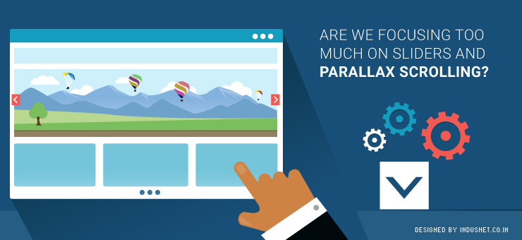
A lot of web visitors often find it strange that every website these days comes with parallax scrolling and slider images. While these techniques are excellent for most visitors, certain people who are not used to image-rich screens feel alienated. People who have been using the Internet for decades and are used to textual content, often find it distracting to see images that slide and change. They also find it difficult to scroll down for all the information. What a web designer must consider If you are a web designer and were wondering if you should omit the parallax and slider features, think about it this way. Who are your target audiences’ and what do they want? No wonder that the Internet is changing and a lot of us will want to get our websites designed in a manner that is more in sync with our times. However, we may end up alienating certain niche groups that prefer to have a more text-based website that does not have parallax features. There is also another side to this story. Many newer web design companies and rookie designers go for parallax scrolling because that is the template you most often get. This calls for a completely different solution, which is, customized development based on client requirement. A lot of clients actually do know what they want and if someone is trying to shove parallax templates down their throat, it is easy to see why: parallax and slider templates are easily available and they are the “in” thing now. It is easy to alter these templates a little bit and sell it for a premium to the client. This is not only professionally lazy but also unethical. It is all about custom development One needs to understand that each design has its place. Parallax and slider features work well with a certain kind of web user. For another, it may be important to have the good old textual website that is more accessible. Understanding who is going to use the website and continuously customizing one’s website is the only solution. If we simply ignore sliders and parallax features just because they are too common today, we may risk alienating younger and trendier audiences. Thus, it is important to understand the target audience and come up with a design plan that is customizable in the future and now. Always remember to consider who needs what Parallax websites are great for companies that offer a few services or products. However, if your company is really huge, it might be a better idea to incorporate certain elements of old fashioned heavy coding. Moreover, sliders can be incorporated or discarded based on your requirements. The only way you will ever know if you should go for sliders and parallax scrolling or a more conservative design is by speaking to professionals who are well versed with advantages and disadvantages of both styles. If you have budget constrain, you could try and opt for a template that will suit your purpose. Otherwise, it is a better idea to choose customized web development solutions that will help you to maximize your web traffic and reap profits in a better fashion. At the end of the day, purpose of a website is to help you gain useful traffic that will convert to sales. For that to happen, it is always advisable to focus on a website that is designed specifically for the target audience. There is no such thing as parallax is not advisable or that sliders are a distraction. It is the purpose of the website that is more important. Web developers and clients must consider all these aspects before deciding on a course of action. If you need assistance, you could always speak to one of our professional developers who will be able to guide you.

Read More »

Which Should You Prioritize? Design or Content?

Social media accounts, belonging to companies, have given rise to a whole new phenomenon in which companies try to design their social media pages in sync with their brands. Most companies still have not begun to make use of this important branding strategy. Social profiles of companies are, usually, the first point of contact for customers and clients. If your social profile is designed well and is attractive enough, people will spend more time on it and read through what you have shared. It is becoming increasingly important to get custom Twitter backgrounds and Facebook pages. While more people discuss designing social profiles, the focus on content seems to be falling back. It is important to focus on content as well as that is as important as design, when it comes to social profiles. Companies often ask if they need to focus more on design or content when it comes to launching their social profiles. In this article, we would evaluate the importance of both content and design, in order to understand which one is better and on which you need to spend more money. Why focus on design? Design has always been one of the primary focus areas of branding. Whether it is the color scheme or formatting or typography, design has begun to take precedence over other aspects of IT and branding. This is a good sign, as psychological research shows that people often judge a website based on its design. Similarly, it need not be an extrapolation of facts, if we assume that people will judge your social profile based on its design. Likewise, many companies have begun to invest in customization of their social profiles. Facebook pages and Twitter accounts can already be customized to suit your branding strategies. What remains important is the way we make use of these various design tools to reflect our core marketing philosophies. At the end of the day, our social profiles need to resemble our main websites and branding strategies, if not an exact replica of the main website. You can probably speak to design specialists and branding professionals to get your social profiles customized to suit your core branding strategies. Steve Jobs famously said “Design is a funny word. Some people think design means how it looks. But of course, if you dig deeper, it’s really how it works.” His argument was quite clear and it worked for Apple. IT is all about how things work. Your social profile has to work. It has to fulfill its functions and be the face of your company to an online audience. On the other hand, Paul Rand stated that “Design is the method of putting form and content together. Design, just as art, has multiple definitions; there is no single definition. Design can be art. Design can be aesthetics. Design is so simple, that’s why it is so complicated”. Paul Rand brings the importance of content to the foreground. In the next section, let us take a look at the importance of content. Why focus on content? Content always needs to be the primary focus of any social marketing initiative. If you do not have valuable content that people can use, your social profile is simply not worthy enough for people to visit time and again. Moreover, social profiles are not used only for customer relationship management or crisis management. They are increasingly being used to share information, educate and inform customers & clients. It is also a great way to attract prospects and convert them into customers. Whether you share a blog post on Twitter or an entire photo album on Facebook, depicting your recent event, social profiles are an important platform to build your content strategy. Content, on the other hand, is crucial for ensuring that you remain relevant in an ever-changing world. If your content evolves along with the world, you will remain relevant and useful to your audience. This is one of the reasons why people tell you that content is more important than design. You can probably have the best-designed social profiles out there. However, if your content is not up to the mark, people will simply stop visiting your profile. When Howard Gardner said “I believe that the brain has evolved over millions of years to be responsive to different kinds of content in the world. Language content, musical content, spatial content, numerical content, etc”, he couldn’t have been closer to truth. There are far too many kinds of content and all these different types of content need to be available on your social media profiles. The only way it can be made possible is by ensuring that you have a consistent content marketing strategy, which focuses not just on  textual content but also on images, numerical data and other forms of media. All these are important to ensure that there is a cohesion within the content marketing strategy. Content or design? This is a rather difficult question to answer. One cannot replace the other and it would be foolhardy to say that content is more important than design. It is equally foolhardy to say that design is more important than content. Any social marketing venture we undertake needs to involve focus areas of both content and design. In fact, professionals know that content and design are inseparable & you need to try to intertwine both of them as much as possible. When you have your design and content strategies in place, it will become a more holistic way of approaching things & that is what will help you achieve success. Content marketing invariably includes design as well and when it comes to social profiles, both content and design go hand in hand. If you are confused about which one to focus on, you need to really stop where you are and decide to focus on both. One cannot avoid either the design aspect of social profiles or the importance of actual content. Both the factors go hand in hand and help you

Read More »

How to A/B Test the Home Page of Your Media and Publishing Site?

With the onset of digital era, the most important challenge for the Media, Publishing and Entertainment (MPE) industry is to go digital. This newly evolved age has not just brought in a number of new challenges but has even changed the way this industry used to work. Presently, you as a part of this industry have to cope up with a completely new set of user behaviour and meet highly competitive industry standard; and the first thing that you need to do to capitalize new opportunities in this consumer-driven, fast-paced industry is to have a properly functioning home page, if not a easily navigable website. Now, how to know whether you have the perfectly running homepage for your website? It’s easy! All you need to do is A/B test the home page before launching it. Here are some excellent ideas that can help you A/B test your media, publishing and entertainment site’s home page: Testing a Home Page Being the point of entry to your website, the home page gives visitors an idea about your brand value and products & services offerings. Hence, it’s highly important to have a proper home page that can encourage return visits. Here is how to test the homepage of your website: Content that Encourages Return Visits It is said that “Content is the King”. So, the first thing that you need to ensure is that your home page has got content interactive enough to not just attract and engage visitors but even to force them to come back to your site again and again. It’s always better to use short content modules in media and publishing sites as the separate headings attract more attention. Once you become sure that your home page has got interactive content, check whether it is able to increase the number of return visits and page views of your website. Page Navigation Make sure that your home page allows visitors to navigate around the website by category, without having to click on any particular category. This helps visitors consider content that they otherwise wouldn’t have checked. Hover states are even quite effective for attracting visitors’ attention to sections, which they might not explicitly look at. Hence, before testing the hover state, ensure that it includes sub-categories, top stories and imagery. However, too many categories and sub-categories might have a negative effect. Once done with the categorization, check if it has increased your page views or decreased the bounce rate of your home page. Though the test might sound a little difficult, however, you can simplify it by deploying the following methods: Choosing top five clicked sections Selecting top sub-categories in each section Hover displaying of those sub-categories Value Propositions Value prop is another essential aspect to be considered while A/B testing your home page. After all, it is highly important to make the visitors realize what value they would get, if they subscribe to any of your online publications. However, make sure that the content of the main value propositions are descriptive and clear. Once you have promoted the value props of your home page, test the page with and without value props & check which one has an increased subscription conversion rate. Now that you know how to A/B test your home page to get a better customer attention, it is no longer difficult for you to take your publishing business to a new height by going digital. All you need to do is follow all the aforementioned steps carefully.`

Read More »

So, You Think You Can Be an Art Director?

The job title of an art director is very tempting, even for those who are in no way connected to creative departments. The title is, usually, associated with independence, respect, creativity and being “above-us-all”. However, the reality is not such. An art director, usually, has a lot of responsibilities but the title is not the glamorized job profile it is made out to be. It takes a lot of creativity, effort, leadership skills and qualities of being able to innovate and inspire creativity in others. Art directors, usually, lead a team of creative people in film & TV, publishing, web design, marketing, advertising, product design and a number of other fields. An art director helps creative employees to remain true to the company’s ideals and also inspires talent, when he or she finds it. It is, usually, associated with managing a team of designers but it is a lot more than just that. To be an art director, special skills are required, which others might not have. So, when we think we can be art directors, we need to understand that the job profile is not what we want it to be and it can actually be quite a lot of tough work. In this article, let us take a look at what an art director needs to have, apart from the obvious creative skills. The job of an art director is not about hierarchy A lot of people think that an art director has the supreme position within a creative department. This is a fallacy that needs to be addressed. If you want to be an art director and you believe in exercising your hierarchical power or authority, you are sadly not fit for this job. A real art director does not believe in hierarchy and instead, exists to recognize talent, where it stands and nurtures it. An art director needs to act as a mentor or a supporter of the creative team. He or she does not have the job to boss over a team of extremely talented and creative people. Creativity goes against the principles of corporate hierarchy and authority. It values democracy, chaos and sometimes even anarchy. Your job as an art director is to respect this need for independence and creativity & promote a culture of mentoring, which helps to channelize this creative energy into something that works well for the company. If you are a web design company, your job as an art director is to encourage web designers to think out of the box, innovate and find inspiration in places they wouldn’t look for. Do you have people skills and the ability to network? An art director also doubles up as a manager of the creative team. Yet, he does not manage the creative team but instead, helps the team to connect with other external entities. This means, an art director needs to have good people skills, the power of persuasive skills and the ability to make new connections. All this requires a pleasing behavior and the ability to not come across as a creative airhead. If the art director has streaks of snobbery, it will not work well for the company. There needs to be an element of humility and quest for knowledge, which is what sets the creative department apart from the others. An art director, thus, has to know how to network, publicize and engage the team in various networking activities. Creative people are, usually, good at networking with other creative people but when it comes to non-creative teams like administration, management and development, they often feel peeved. An art director’s job is to ensure that the creative team’s message is communicated to external agencies in a coherent and understandable manner. Analyze yourself before applying for the position of an art director If you think you are creative, that is not the end of it all. You also need to have mentoring skills, the ability to network, the quality of engaging external entities and a clear non-hierarchical attitude. You need to be able to recognize talent, where it exists and be able to nurture it. It is not a job that allows you to sit in a cabin but will require you to work hard. If you think you have all these qualities, go ahead and lead a team of extremely creative & talented people.

Read More »

How to Build the Perfect Landing Page which Won’t Let Your Visitors Go

Landing page is the first page seen by your visitors on your website or blog. Landing page needs to be built in such a manner that it stimulates the visitors to take an action as expected by you. Suitable landing page enhances user experience and your marketing goals are very likely to get accomplished. If your traffic goes to unsuitable landing page, visitors will abandon you and you will hardly get any conversion. Marketers need to be wary of committing such a mistake. Before we discuss how to build a perfect landing page, you need to know what goes into planning a perfect landing page. Clarity of goals What do you expect visitors to do when they land on your webpage? Is it subscription to newsletter? Download an e-book? Submit their basic information? Buy? Follow your social media profile? Whatever it is, it needs to be directed through your landing page. If your landing page is irrelevant, customers will get confused. Having clarity of goals is must and they will further help you to track conversion rate of your marketing campaign. Know your competition Which kind of landing pages are being used by your competitors? You have to build upon that. Anything less is unsatisfactory. Are they offering better experience for the visitors? If they do something new, try to imitate that. Customers are flooded with choices today, knowing your competition, their strategy and campaign is crucial to take a lead. Also, follow your industry leaders and see what they are doing. This will inspire you to think big. Know your audience The reason for you to be in business is your target audience. Once the segmentation part is over, how do you position your company, product and brand in front of the audience? For that, you need to understand a lot more. As a marketer, you should know that most of the decisions made by consumers are driven by emotions. Do you empathize with their expectations and aspirations? Understand the variation required in landing page Your target audience could be spread across the globe. Traffic could come to you through social media networks, ads, emails or blogs. Try experimenting with the message depending upon the source of the user to offer a unique experience. Businesses with different landing pages often get more results than others. In the beginning, try to find out the sources from where majority of your traffic comes. Make a variation on those sources first before moving ahead. How to build a perfect landing page? 1. Collect contact information on landing page itself People always think twice before giving their contact information online. You will augment their dilemma by forcing them to navigate. The result is that you lose out on customers. So, when you are directing them to a page to get their contact information, always use a strong headline stating the benefits to be offered by you. For instance, is it a subscription to newsletter, eBook download or anything else? Use a strong call-to-action. While offering a free download, it is advisable to use an image to enhance visual appeal of your digital product. The opt-in form needs to be short and simple & seek minimum personal details. 2. Content-specific landing page If you are creating a lot of interesting content with a large shelf life, it is a great idea to create content-specific landing page. Delivering the information sought-after by customers on landing page itself will save their time in navigation. Take a call on which topics you want to be featured on landing page and then create one for each topic. Including a short introduction to each post gives it more attention. The landing page, thence, can be promoted on social media networks and emails. 3. Landing page for first-time visitors A first-time visitor might not be sure which part to navigate first on your website or blog. It is quite possible that they land on a page where they don’t find anything interesting. By creating a custom landing page driving them to information necessary for first-time visitors, a lasting impression will be created. Even if a new visitor lands on an unsuitable landing page, include an option of “start here” in the navigation. The introduction page can share about your product USP and how you’ve managed to keep your customers happy. Direct your visitors thereafter to a page where they can seek more information relevant to them. 4. Landing page for visitors on guest post It is always good to write guest posts to tap the audience on popular blogs. Most marketers send that traffic to their home page, which is not a very good thing to do. To maintain the relevance of the guest post, visitors need to be directed to suitable landing page that provides them additional information. This helps in maintaining consistency of the information being shared. It intrigues the visitors to take further action depending upon your call-to-action. 5. Short, sweet and conversion-friendly An ideal landing page is the one that contains just enough information for the visitors. Don’t expose too much information on the landing page that it just shoo the visitors away. The goal of the landing page should be to convert the visitors. Your desired conversion goal could be anything. Visitors need to feel encouraged to go ahead with it through visual appeal, sound design and relevant links. 6. Videos and images A landing page loaded with bright and easy to load images creates more attraction for the visitors. Many times simple links don’t work. Images embedded with links prompt the visitors to take action. Similarly, if a nice self-explanatory video is uploaded on the landing page, it will help the visitors to understand your product and its features. Videos can also be used in place of text to state a point as they carry more weight when it comes to convincing. 7. It needs to be in line with your ad text The keywords used on your landing page should match with

Read More »

How Does Responsive Checkout Play a Significant Role in E-commerce?

The mobile space has gradually begun to dominate the online space and this is true of e-commerce websites as well. In an effort to capitalize on the mobile traffic, many e-commerce websites began to design mobile websites. Of course, this is a redundant exercise now, considering the changes within the design community. As devices became increasingly diverse and the screen sizes began to vary, developers began to adopt responsive design. Based on the philosophy of flexibility and intuitiveness, responsive web design rapidly became popular not only among the design & web developer community but also among clients. Today most well-designed websites are responsive in nature. E-commerce websites, which usually cater to an active audience, which is mostly interested in shopping or cataloging, started to toy with responsive design much later. This was because it was harder for e-commerce websites to come up with ways to make websites that worked well on both computers and mobile devices. This was, especially, true when it came to the checkout process. E-commerce websites today have begun to adopt responsive checkout, which helps in a mobile-first paradigm. This helps e-commerce website owners to concentrate on building businesses, instead of running after incomplete purchases made from tawdry mobile websites of the past. In this article, let us understand the need for responsive checkouts and how they help e-commerce websites. Responsive Checkout by Shopify Exceeding number of people have begun to use their smartphones to make purchases. Shopify, the Canadian e-commerce company launched its version of Responsive Checkout in October 2014 and the popularity of the tool has only grown ever since. This points toward a phenomenon that is increasingly mobile in nature. More than 50% of traffic to e-commerce sites today comes from smartphones and tablets. It is very important to ensure that your online stores use responsive design practices as discussed above. Responsive Checkout is a tool that helps customers to view layouts that automatically adjust to the screen size of their mobile devices. This avoid scrolling endlessly, entering a lot of information and other discomforts all of which add up to the risk of a customer not making a purchase. Whether a person uses a laptop, smartphone or a tablet, Responsive Checkout ensures that there are no abandoned shopping carts. With all the A/B tests, improving and iterating in order, Responsive Checkout by Shopify is one of the better solutions today. How does responsive design help e-commerce websites? As the usage of cellphones increases, the rate of abandoned shopping carts increases too. Smartphones and tablets have a greater chance of distracting the customer. A message could pop-up, a call might just arrive or the customer might feel like taking a selfie. Without being crude, it is important to state that we need to make sure the customer makes the purchase as quickly as possible, without unnecessary distractions. Responsive design ensures that the customer does not have to scroll down, navigate or enter information on a screen that is already small. Responsive design also ensures that companies are able to hasten the process of checkout so that more sales arrive from mobile devices, which are today’s primary source of traffic. Responsive design will eliminate the need for frantic calls and emails that one, usually, makes when there is an abandoned shopping cart. By ensuring that sales happen more often, Responsive Checkout helps e-commerce websites to tap into mobile market, instead of being unnerved by it. What is the future of responsive design with respect to e-commerce stores? The current trends indicate that people will continue to purchase on mobile phones and tablets, driving a growth for responsive design. E-commerce websites will find it increasingly important to withhold the attention of their customers. Thus, to avoid abandoned shopping carts, it will become necessary to employ responsive design within the checkout process. Shopify’s Responsive Checkout already exists but you could also speak to professional designers and developers who can help you arrive at custom solutions to create responsive checkout pages. This will help you to reduce lost opportunities and thereby, increase your profits in both short and long terms. Certainly, responsive design will be an important focus area for designing checkout pages on e-commerce stores.

Read More »

Tumblr vs. Pinterest for Web Designers

The hottest social networking site right surely is Pinterest and it is known to drive a lot of traffic to websites. Tumblr on the other hand is a popular microblogging platform, which has been around for quite a while. There are similarities among both the services, and each works for different purposes, users and situations. Differences between Tumblr and Pinterest Tumblr is a micro-blogging platform that can behave like Twitter, act as a simplified version of WordPress and is a place to engage in discussion. Pinterest on the other hand is a visual bookmarking tool, that allows you to collect images and videos (and the links therein) on various categorized boards. Both of them depend more on media than text, but are fundamentally different. However, people do use Tumblr to collect pictures and images much like Pinterest. Both the tools can be astonishingly useful to web designers and developers. Let us compare the two services in order to understand which one could be better than the other. Team Collaboration Pinterest allows users to add contributors, which means collaborative collection of images found on the Internet or images that are originally taken can be easy. Pinterest can allow web designing companies to allow several designers to pin images that they like, in a form of visual brainstorming. Commenting and liking images, or pinning them back allows for socializing as well. Tumblr on the other hand is a fully functioning blogging platform that allows for lengthier discussions in the form of comments, and also in the form of text posts. As it follows a blogging structure, web designers can easily publish their strategies, ideas, tutorials etc easily. Collaboration in the real sense may be easier on Tumblr if we were to talk about combining blog posts, images, textual content and videos. Pinterest can be used as bookmarking tool or a place to showcase templates and designs you have created, before or after brainstorming. Marketing and Promotion Pinterest discourages self-promotion, whereas Tumblr doesn’t frown upon it. It is easier to promote oneself explicitly on Tumblr than on Pinterest. On Pinterest, you will have to use tricks and covert methods to promote your products or services. It might be a good idea to drive traffic from Pinterest to your Tumblr blog, where you actively promote your products. Pinterest has a majority of female users, where as Tumblr’s target audience is mostly youngsters. It depends who your target audience is before launching a marketing campaign. However, Tumblr seems to have a better marketing traction. SEO and SMO Both Tumblr and Pinterest are valuable SEO tools. They drive traffic to your company website, help you to generate organic traffic, and also achieve better search engine rankings. Interface Tumblr has more freedom to publish content, and doubles up as a blogging platform as well. Pages can be added and a simple website can be created within the Tumblr platform. On Pinterest, one can pin images found anywhere on the website, or upload original images and categorise them under various boards. Pinterest is more visually oriented than Tumblr, where as Tumblr is more of a publishing platform. Engagement, Discussion and Participation Tumblr allows better engagement and discussion. Thanks to its micro-blogging platform, it not only allows likes and re-blogs but lengthy discussions can happen in the comments section. Pinterest on the other hand allows commenting too, and images can be re-pinned or liked, but lengthy discussions are just not great enough. Web designers who need to discuss projects, tricks and tips, cheat sheets would do better on Tumblr. Web designers who need to showcase their templates, and basically offer visual eye-candy would gain more on Pinterest. Handling Design Projects Web designers can collect templates they like on Pinterest and also pin websites, portfolios of other designers and logos that they come across while browsing the web. Pinterest can serve as a place where web designers can find all the images that inspired them to design their own website. Tumblr on the other hand can be used to promote and market one’s own design projects. It could also be used to upload HTML5, CSS and other coding files in order to discuss with clients or team members. It serves as a collaborative, publishing and media sharing platform, all put together in a minimalist environment. It all depends on which part of the designing process one is handling. Both the tools are equally important and are not mutually exclusive.

Read More »

How to Hire a Web Designer

Any business or individual will need to have a professional website in order to have an Internet presence. With internet access spanning tablets, smartphones and computers, it is important that someone who designs your website is experienced, qualified and knowledgeable in an array of factors. Thenceforth begins your search for a web designer. Let us take a look at the scenario. Why Hire a Web Designer? Web designers are professionals who build web pages and are responsible for the creative aspect of it. A website has to look as different as possible, and must reflect the character and personality of a company and the business it’s involved in. Web designers make sure that a website is visually and sensually attractive and eye-capturing. They also save time and enquire with clients what they imagine their ideal website to look like Most web designers have knowledge not only in designing attractive web pages, but also know certain amount of web development, programming, graphics, managing and maintaining websites, and marketing the website that you have just got created. While pure web developers can still create websites that look good, they may just use certain templates to do as, as they are more interested in the functionalities and programming that go behind creating a website. A web designer is specifically concerned with how a website looks and feels. Thus, it is crucial to hire a web designer to save time, personalise your website and create a unique brand identity over the web. When to Hire a Web Designer? When a company or individual requires a new website, blog or a webpage Web designers need to be hired when an existing website needs to be revamped or given a new look Altering the structure of an existing website and making it more social media friendly, or more visually attractive When there are aesthetic and interface issues with a website When there are issues with an already designed website What are the “Must” Qualities to Look for in a Web Designer while Hiring? Before hiring a website, one needs to look at a number of factors, ranging from academic, financial to previous work. Here are some of the basics that you need to explore before hiring a web designer. Portfolio: One needs to look at a web designer’s portfolio whether he is experienced or a fresher. Live websites of what is given in the portfolio would help you to gauge how good a web designer is at his work. You might want to see if there are broken links within any of the websites mentioned in the portfolio, design errors, aesthetic blunders, typography and such. Business Website: A good web designer would always a business website. He or the web designing company is an advertisement for the kind of work that you can expect. However, it doesn’t necessarily mean that a great business website translates to great work. However, it is one of the indications. Skills: A web designer would of course have Flash, Dreamweaver, Photoshop and other graphic tools’ expertise. However, you need to confirm if they also know HTML, CSS and JavaScript. They should also be able to bring someone who can write content or know about Ajax, graphics creation and such. Finances: You must enquire how much they cost. In web designing, it is usually what you get for what you pay. However, it is important to know that this shouldn’t be your primary concern. Accessibility: You would need to make sure that you can contact them after the work is completed and that they are always approachable. Look for a business telephone number in the place where they are based. References: References can help you a lot. While you may not get the best designer in town, you certainly won’t get the worst either. Personal Interaction: Interact with the designer, talk about designing, what they like, etc. general conversations can tell a lot of things about a person. Whom Should You Never Hire? Basically you must not hire a web designer who doesn’t meet the criteria above. To elucidate: Lack of portfolio and references: There are many freelance web designers who either do not have portfolios or have a shoddy collection of templates in the name of a portfolio. Avoid them. Some also hesitate giving references. Again, a big no. Business Website: A web designers website says a lot about him or his firm. If there are broken links or if the site doesn’t feature a sitemap there is no guarantee your website will be perfect. Avoid them too. Price: If a web designer demands more than 50% of the total sum upfront, you should avoid them as well. Web Designers who are Graphic Artists in Disguise: While graphic artists can build basic web pages, they are not web designers. Anyone who doesn’t know HTML, CSS, JavaScript and doesn’t give you marketing support should be avoided. Hiring Individual Designer vs. Hiring from an Outsourcing Agency There are many advantages to hiring a web designer from an outsourcing agency than hiring an individual designer. Access to Other Professionals: When you hire a web designer from an outsourcing agency, you are also getting connected to web developers, graphics designers, SEO professionals, programmers and engineers who may not be accessible through a single web designer. Lower Cost: An outsourcing agency tends to receive a lot of work and thus the cost of designing a website would be significantly cheaper than getting it done from an individual designer. Quick Turnaround: An outsourcing agency takes its business very seriously. With more hands at work, your website would be ready quickly. Experience: A firm always receives more work than an individual designer. Thus, they carry that experience and knowledge. Versatility: An outsourcing agency would be used to dealing with all kinds of clients. This leads to versatile thinking and creative solutions.

Read More »

Web Designers vs. Web Developers: The Real Showdown

One of the often repeated sagas in the world of web designing is who is better, the web designer or the developer. Turns out, many-a-times the web designers and the web developers too can’t decide and each believes his profession is superior. This clash of egos results in certain comical situations but mostly unfortunate incidents where if the two worked as a team, the end product (the website) would be much better. Who is a Web Designer? A web designer is responsible for the way a website looks and feels. He is responsible for the artistic, graphic and creative aspect of a website. A web designer is most approachable to the client as the client knows how the website must look. A designer thus uses certain web designing tools (Flash, Photoshop, Illustrator, Dreamweaver, etc) to play with layouts, colors and typography. Web designers are responsible in making a website unique and special, standing out from the rest of the competitors. Who is a Web Developer? A web developer on the other hand makes sure that the engineering of the website is done right. A web developer uses advanced coding, programming languages (C++, Java, PHP, etc) and other techniques to make a website functional and usable. Web developers are less concerned with the creative aspects than the functional aspect of a website. A web developer makes the website ‘happen’, based on what the designer hands out in a PSD file, for instance. Stereotypes of Web Designers and Developers Everyone has heard of the nerdy and geeky developer, who sips gallons of coffee, doesn’t trim beard for days and is slightly asocial, when compares to a designer. A web designer on the other hand is stereotyped to be creative, trendier and more social of the two. These stereotypes unfortunately are played by the professionals themselves, without realising that they are falling victims to ego clashes, which are certainly not necessary in a team. Do take a look at what the professionals themselves have to say about their professions! Also, take a look at an infographic that describes the stereotypes about web designers and web developers. Thus, one could say that a web designer takes care of the designing and creative part, where as the developer takes care of the coding, programming and functional aspects of a website. Both are crucial for a website to work the way it should, and look the way it should. Reasons of Conflicts between Developers and Designers There are many reasons for conflicts between web designers and web developers. There are certain communication gaps and ego clashes that work against working in a single team. Moreover, designers tend to be more creative and find coding and functionality self-limiting. Developers find creativity and divergent thinking radical, and contrary to what they believe: stability and functionality. These basic differences in opinion, attitude and ego-clashes result in most of the conflicts between the two. For instance, developers find it difficult to work with Flash files and designers may not want to work with HTML and CSS because they are not used to them. Designers also tend to be slightly less organized than developers, who almost tend to be OCD personalities. For instance, developers may find it very infuriating to work with unnamed PSD files with several layers. Lack of communication gives rise to most of the conflicts between the two. Take a look at this argument by developers about why they think they are better than designers. However, such arguments need introspection, and only working together can create great results. Advantages of Conflicts and How they May Help in Projects Conflicts always need to be resolved, and when we talk about conflicts between designers and developers we must understand that there are possibilities for opportunities. There are also certain advantages to these conflicts. A dreary argument between a designer and a developer may lead to brainstorming. Brainstorming usually results in clarity of thought and acceptance of difference in opinions. Thus, a conflict may help to increase creative energies and result in a successful project. How to Minimize Conflict and Work Together to Create Great Projects Patrick McNeil, the content director of HOW Interactive Designer, is the author of The Designer’s Web Handbook. The book helps designers to deal with issues they encounter while web designing. It also helps them to tackle issues that they may encounter with developers. He maintains that both of them need to work together, and each can’t do without the other. The best way to minimize conflicts is to communicate. Communicating what seems to be infuriating can give rise to a number of solutions. Moreover, one must also accept that it isn’t possible to do without the other and both web developers and designers need each other no matter how different their thought patterns are. Designers + Developers, Designers vs. Developers

Read More »

Designing Websites and Products that Evoke Positive Emotions

Cognitive science helps us to understand that there is more to consumer decisions and choices than just good products. While good products and designs are fundamental to their own success in the market, certain choices and decisions made by consumers are not limited to the intellectual quality of a product’s benefits or superiority over others. Design’s Underlying Cognition Psychologists believe that consumers make decisions on an impulse, and the attitude and opinions they develop towards a company, its products or its designs are largely based on their own life experiences, mood states, emotions and certain personality characteristics. One could say that psychological processes like perception, memory, emotions and cognitive schemas play very important roles in consumers’ decision to purchase certain designs and reject others. Jeroen van Erp, co-founder of Fabrique, a multidisciplinary design agency proposed an inverted pyramid model that depicts designers as having the responsibility of creating aesthetic products which provide meaning and evoke emotions in consumers. It is a role that is perhaps more profound than that of an entrepreneur’s, whose job is to profitably sell his products. Psychologists also emphasize that many purchases are emotional in nature, and attitudes are formed when there is an emotional reaction towards a product, when certain memories from past life experiences elicit strong emotions in consumers. These emotions are elicited when a consumer encounters certain product or a design. Emotional Design: Why We Love (or Hate) Everyday Things by Donald Norman explores the underlying psychological process of buying. The book helps designers and manufacturers to understand why it is important to consider emotions, perception and other cognitive processes while creating websites or designing products. Emotional Designing for an Internet Driven World In a world that is dominated by ecommerce and web-driven marketing, a company’s website becomes an intermediary between products and services and consumers who purchase them. A well-designed website has the ability to capture and sustain a consumer’s attention, and this attention can be translated into a positive perception if the design or layout of the website attempts to do so. Perceiving a website positively usually results in processing of that positive information and associating it with positive life experiences. For instance, a website that is designed aesthetically may encourage a consumer to associate those colours with an art class that they took in school, which probably was a very positive and satisfying experience for them. These positive memories evoke positive emotions and mood states that help consumers to associate that particular website with joy, satisfaction or even self-actualization. Emotional Designing for Webpages If we are talking about how one could elicit positive emotions when designing a website, one must understand that the web page is akin to canvas. The canvas can be ‘painted’ with aesthetic images, contours and colors. Intuitive navigation and task-oriented functions are processed by visitors as credibility, trustworthiness and security. These perceptions evoke positive emotions that may translate into loyalty and continued visits. Of course, positive text and careful usage of words, avoiding jargons and not being circumstantial and tangential allow for information to be rendered in an aesthetic manner. Apps and Emotions While designing web or mobile applications, similar psychological and cognitive themes can be applied. An intuitive interface, colors associated with trust, simplicity and minimalism, and reduced clutter in app design help in evoking positive emotions as well. Using minimalism, intuitive layouts and contours, and elegance can help in evoking positive emotions from products and devices as well. Thus, a designer must bear in mind to consider aspects that have direct emotional consequences. Tapping Sensual Responses Sensual stimuli that activate visual, tactile and auditory receptors usually evoke emotions. Products and websites must be designed to please the eye. If possible, websites can have audio in the background and touchscreen capabilities of applications and websites allow for tactile stimulation. It isn’t possible yet to tap olfactory (smell) and gustatory (taste) responses when designing websites, but one can’t predict the future! Emotions are strongly connected to social situations and thus anything that can be shared, help in starting conversations and be an extension of consumers personality always help. Thus, designing for emotions is to remember that customers can and do make decisions based on feelings, impulses and mood states and not based only upon rational arguments and logic.

Read More »
MENU
CONTACT US

Let’s connect!

Loading form…

Almost there!

Download the report

    Privacy Policy.