Category: Web design

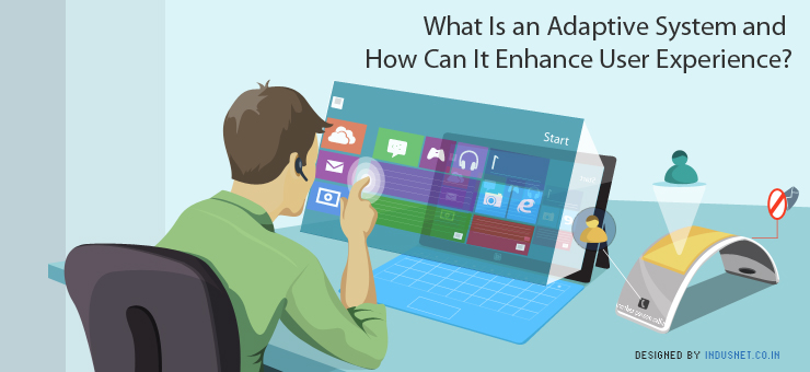
What Is an Adaptive System and How Can It Enhance User Experience?

We are slowly beginning to see an increase in the usage of adaptive systems in the field of technology. It can be described as an interactive system that changes or adapts to a changing environment, in this case that environment entails a user’s preferences and behavior. It also changes based on the context of use as well. Adaptive System and Its Applications in Modern Computing Adaptive systems take computing to a new level as the computer begins to make guesses about what you need and changes itself accordingly. The technology is already in place in Internet, smartphones, and other devices. The future is going to get even more dependent on adaptive systems. In fact, we will see a growing dependence on adaptive systems to enhance UX. GPS navigational systems, search suggestions in Google, touchscreen keypads that guesses the next word you may want to type, autocorrect changing a misspelled word or a word that is out of context in a sentence are all examples of adaptive system. User Experience Can Be Improved with Adaptive System UX professionals usually tend to design an interface depending on people’s choices. For instance, most smartphone users do not like to key in text. Thus, UX professionals ensure that there is scope for adaptive system so that voice commands can be given in place of actual typing. Another way is to introduce Bluetooth into devices so that they can communicate specific data among different devices. There are several iPhone applications that let you control the temperature of a barbecue being cooked. The idea behind this is to use Bluetooth technology and pair it with a second device that comes with a thermometer. The data is then sent to an iDevice and an individual who is elsewhere in the house, or even a block away, can control the temperature of the grill. Adaptive System Enhances UX by Weaving Itself Into Everyday Life Adaptive system is all about changing an interface and the way a computer (or any device capable of computing) behaves. Adaptive system is based on the belief that the most profound technologies do not stand out but instead weave into the fabric of everyday life and become indistinguishable from it. For instance, Internet itself has an adaptive system as it is so clearly embedded into our lives. The more such adaptive systems are installed into devices and software programs, the better the user experience is going to be. Future of Adaptive Design or System Adaptive design is going to be very important in the near future, not that it already isn’t. It integrates subtle and obvious features in an unobtrusive way, so that the end product or service has an easy user interface. The idea is to improve UX by making technology as unobtrusive as possible. Moreover, adaptive design helps programmers, designers and product manufacturers to understand how people use the very same products and services. Based on the information that is collected, products can either be enhanced or made simpler and more user friendly. Integration of Behavior or Personalization Technology Adaptive systems integrate behavior targeting or personalization which means a websites and landing pages are specifically designed for a target audience and as they use it, changes are made so that it adapts to their needs. On the other hand, it also involves personalization technology thanks to which you can enable dynamic insertion, customization of content or suggesting content depending on what the user is using. Open data is only making all this even more accessible and useful. Adaptive design as we mentioned earlier, will integrate several devices from everyday life with the help of Bluetooth or Wi-Fi and enable smart communication amongst them. The user can then control one device with the help of another. At present, adaptive design is extensively used while designing iPhone applications that control secondary devices fixed around our houses. The present and the future will depend heavily on adaptive systems and adaptive technologies which will help us to construct a world that is quite different from what it looks like today. Though the world will change in essence, it may not look very different from what it does today. Adaptive design and adaptive system will continue to change our worlds subtly, unobtrusively but surely.

Read More »

What Is Macrotypography? How Can It Increase Readability of a Web Page?

Typography can be broadly divided into two subcategories. They are, microtypography and macrotypography. Both micro and macro typographies are very crucial in ensuring readability of a web page or document. This is one of the reasons why designers often insist on getting things right before working with either micro or macro typographies. By understanding and planning typographical themes before designing a website, we can ensure legibility and readability. The idea is to combine macro and micro typographic techniques so that harmonious and readable web pages can be built easily. What Are Micro and Macro Typographies? Microtypography concerns all the details that go into typography. It is all about adjusting the correct glyph, kerning and tracking and making certain choices that improve stylistics. Microtypographical techniques can now be adjusted and manipulated more easily thanks to new CSS attributes which provide better controls over Web type. Microtypography is all about legibility and can be understood as designing letters and words. Thus, the way you design a font, how you decide to let a group of words sit, and how they should look when they are grouped together as a word, and other such decisions are part of microtypography. On the other hand, macrotypography is all about how typography is arranged on a web page. Macrotypographical techniques can be achieved on CSS but we must also bear in mind that the Web itself is changing rapidly. Macrotypography is all about how paragraphs and groups of sentences are placed together and how they appear on a page. Readability of a Webpage Correlates with Macrotypographical Techniques Readability is all about how paragraphs are placed on a web page so that it is easy to read and understand. It has got more to do with aesthetics but also a lot to do with design, reducing eye-strain and maximizing attention and concentration. When readability is increased, user experience (UX) improves too. When a website doesn’t read well, a visitor may be distracted, annoyed, bored or may just leave the web page altogether. If a website is text-heavy and the administrators want people to focus on the printed text than other things on the web page, they must then give importance to readability. At the end of the day, it is all about increasing the process of refinement and making reading on a web page an effortless experience. The most important aspects of a webpage are placement of ads, navigation tools, related links and the actual text. Our focus must be to highlight the textual content than anything else. Macroreadability is all about how text or typography within this text space is placed so that readability is increased. Margins must be drawn so that there is enough gap between advertisements and navigation bar. Moreover, if there is a lot of white space that is left unused, it is found that readability increases. Content providers must write content in smaller paragraphs and never in large and humongous paragraphs that are difficult to read. Line lengths, margins, font size and other features must be manipulated so that readability increases. Most typographic professionals often forget to choose the right paragraph style. Paragraph styles can be crafted on CSS and you can choose indents, line breaks and long-form text depending on your convenience and the target audience. Long-form text usually appeals to the more brainy readers than the common ones. Another important consideration is that of the text’s contrast. Low contrast causes squinting and high contrast causes pupils to dilate a lot. Thus, the contrast should be adjusted so that eye strain is reduced or at least minimized. In summation, we may understand that typographical choices solely do not just depend upon fonts, font sizes and the way colors are manipulated. It also depends on macro factors which include the way a paragraph is placed, how the margins are drawn and how much white space is left. All these factors lead to great typographical results and a better readability index. When a website’s readability increases, the number of visitors who spend a longer tie on the website also increases. With that in mind, if you have any typography related queries, you can contact our web designers and typography specials who will be able to clear your doubts and answer your questions regarding what is best for your business.

Read More »

Microsoft’s Mysterious Surface Book Reminds Us that Responsive Web Design Is Important

Microsoft Surface tablet has barely hit the stores and there are already rumors that the device can earn a successor in 2013. According to those rumors, Microsoft is already working on three new models: the RT Surface 2, Surface Pro 2 and a mysterious device called Surface “Book”, with a display of 14.6 inches. Among the devices leaked, the third model in the Surface series, called “Book”, is what causes most people to stand up and notice. The device will feature a 14.6 inch display, a first in its class, and will come with a new processor “Haswell”. The RT Surface 2 will have a screen of 8.6 inches and a new processor will be developed in partnership with Qualcomm. Meanwhile, the Surface Pro 2 tablet with Windows 8 will get an 11.6-inch display and an AMD chip created by, called “Temash, a new generation of chips that combine CPU and GPU. The component will replace the Intel Core i5 that is present in the current version of the device. Microsoft Is Finally Working At Nailing Its Competitors Temash, the new processor from AMD, and Haswell, by Intel will only be available from the second half of next year. Therefore, it is likely that the new Surface devices will only hit the shelves during Christmas 2013. These and other considerations apart, it is amazing how quickly Microsoft is going ahead with its plans to launch new tablets, There are two important things to notice here: tablets are growing by leaps and bounds, and Microsoft is not likely allow itself to be pushed into the corner by iOS and Android devices. Microsoft Surface Book’s Competitors Apple’s iPad Mini has found considerable success too ad is being touted as a better version of the earlier tablets, though they were larger in size. Apple already has a very huge market and is the largest tablet manufacturer in the world. This alone sets Apple against Microsoft in a very strong manner. Then again, Samsung’s Galaxy tablets have done very well too, and Android lovers have often bought Samsung tablets in a fanatical manner. This healthy competition is finally driving Microsoft to create products that excel not only in terms of specifications and technology, but also in terms of innovation and design. Surface Book Is a Re-Imagined Tablet The Surface Book seems to be a tablet that is modeled on Netbooks or Notebooks. Notebooks and the more recent netbooks had been very popular until Apple released its iPad. The Surface Book will certainly be a large screened tablet that almost behaves like a laptop. With more people already getting used to tablets and touchscreen typing, it shouldn’t be very hard for Microsoft to launch a completely re-imagined tablet next year. Responsive Web Design Comes to Rescue When there are so many different screen sizes and display options, it will certainly cause confusion among business owners and web designers who often have to deal with several screen sizes. The new tablets may force web designers and developers to new limits in order to create websites that look great on all screen sizes. We have often noted that Responsive Web Designing is the key to all these problems. Responsive Design negates the disadvantages posed by differing screen sizes. It makes sure that all the websites and applications look great on every screen, and there will be no necessity to design separate websites for each kind of device. With Microsoft Surface Book in mind, we do believe that responsive Web Designing will completely change the game and will no longer leave web designers scrambling for solutions that device compatibility poses. Why Speaking to a Web Designer Is Important If you are worried about your website not appearing clean and great on different devices and screen sizes, speaking to one of our web designers may put your worries to rest. It is always a great idea to speak to someone who knows the intricacies of web designing not only aesthetically, but also in a coding point of view. We must remember that there will be many devices that will be launched by rival companies to match the intrigue that Microsoft’s Surface Book will leave next year.

Read More »

Why Single Page Websites Are Great for Certain Businesses

A growing tendency among web designers is to create single page websites. Most people are aghast when we suggest single page websites to them, as it goes against conventional ideas about how a website must be. Usually, business and professionals expect websites to have at least 5 pages, with each dedicated to ‘About’, ‘Products and Services’, ‘Blog’, ‘F.A.Q’ and ‘Contact’. This is a very simplistic view of a website and sometimes, websites need to be more complex or simpler. It all depends on what the clients’ requirements are and what sort of business a person is running. When to Use Single Page Websites Single page websites work best when there is less content and more substance to offer. It is also great when a company or person has only a single product to offer and further information can be sought by talking on the phone or emailing. With that in mind, single page websites are great as all the content live on the home page and navigation. Users can jump from one section to the other easily without having to switch pages. Single page websites have gained popularity partly because of the use of jQuery and partly because of the ease of maintenance. Single page websites need not be minimalist and simple, they can be very vibrant and colorful as well. Writers, novelists, psychologists, consultants, companies that have only one or two products to offer and other such professionals and companies can use a single page website instead of confusing a visitor with a number of pages. Single Page Websites Are Quick, Simple and Effective A single page website reduces the amount of time that is required to click on purchase buttons and at the end of the day everyone likes a fast and quick way to get the product and information one needs. There is no other format of a website that is quicker and simpler than a single page website. All the information that one needs can be sought right on the same page, which leads to less confusion and noise. They can be an extremely attractive way to showcase portfolios, state interests and even float one’s biography. Single page websites are great even when images are aplenty. If a website is text heavy and the text is related to just one topic, a single page website is again more useful than a multi-page website. Of course, there can be a link that directs users to a blog where you can provide dynamic content. However, for a website that has very little static content to offer, a single page website can be the right choice. Single Page Website Themes There are hundreds of themes available for those who like to work on a single page website. If one does not want to utilize templates that are already available, qualified web designers can help you build a single page website right from the scratch. Whether you need a minimalist website that highlights your achievements and portfolio or you need a classy website that describes the only product you sell, a single page website is a great alternative to clumsy and crowded multi-page websites that we often see even when they are not required. Single Page Websites Are Not Necessarily Cheap or Easy Often, people encounter doubts about why they need to have a number of pages on their websites. In fact, multi-page websites may not be necessary when the information is targeted, minimal and very specific. If information needs to be highlighted than be dispersed, single page websites are again a better choice than distributing information across many pages. However, building single page websites need not be cheaper than multi-page websites as these websites require an equal amount of creative and artistic effort on the part of a web designer. In fact, single page websites may require more effort from a web designer in order to keep things aesthetic and simple. At the end of the day, a website needs to convey the information it wants to convey to the right target audience. It also needs to convey that message in the least distracting manner. If that information is better said in a single page website, then you must opt for a website that has only one page!

Read More »

Understanding Attractiveness Bias and Why It Is Important in Web Designing

Though most of us refuse to admit, we are all draw to things that are beautiful. We are instinctively drawn towards someone who is dressed well, someone who has good features, a building that is built aesthetically, a gadget that looks and feels good to hold, a neighborhood that is pretty and flowers that is pretty and colorful. It is no wonder then that cognitive psychologists believe that humans are innately predisposed to falling victims to what they call “Attractiveness Bias”. What Is Attractiveness Bias? Attractiveness Bias can be defined as a cognitive bias that forces people to look at things that are aesthetically superior. Attractive objects, people and places automatically elicit attention amidst a sea of similar entities. What makes an object, a person or a place stand out is physical or outward attractiveness. Before people start fuming and getting offended, we must note that attractiveness only helps in drawing attention. Attractiveness Bias Draws Attention but Does Not Sustain It However, once attention is drawn, sustenance of that attention can happen only when there is personality, character and value behind the outward appearance. Thus, what looks good but has no value catches the attention of our eyes, but fails to sustain our attention. Though we are immediately drawn towards something attractive, if it is not useful or if it is not profound, we lose interest and move on. Attractiveness bias theory thus proves that a well designed product helps in drawing attention to the essence of the product. Overcoming Attractiveness Bias on Websites A badly designed product will not attract attention even when it is an excellent product from within. However, a product that is very well designed but serves no purpose will attract attention immediately, but will fail to sustain it. This fundamental attribute of attractiveness should teach web designers a valuable lesson. Websites need to be attractive and aesthetic. No one can afford to design badly designed websites. No one likes unattractive and ugly websites. Websites need to be aesthetic, simple, and great to look at. Again, this is only the first step. The content should be great and valuable and that goes without saying. If the content is great and the website is not great to look at, it will fail to register a high number of traffic. Likewise, a well designed website that offers no value to users will immediately attract attention and traffic but this traffic will soon reduce because there is inherently no value at all to the website. Ensuring Value, Character and Quality of Services and Products What companies, individuals and businesses must understand is that their website speed to be very attractive to set themselves apart from the competition and to attract the attention of possible leads, clients, and readers. However, once the initial attention is drawn, quality content, great products and services become mandatory. A well designed website attracts traffic but great content, products and services sustain that traffic. The lesson to be learned is to ensure that design aspects of a website are not ignored. Attractiveness bias will definitely come into play and people will certainly judge your website based on the way it looks, though it sounds harsh. The idea is to design your website excellently so that your inherent value is recognized. The value that you offer will be recognized when it is housed in a great looking website. This is a business principle and a psychological theory that we cannot afford to miss or ignore. Overcome Attractiveness Bias, Offer Real Value to Consumers and Clients Unless your website is attractive, you will not be able to grow your traffic exponentially. In order to be popular on the Internet, your website will have to overcome the Attractiveness Bias. The only solution is to ensure that your website is truly attractive, buy hiring web designers who are professional, artistic and technologically sound. Once an attractive website is built, it becomes your responsibility to build character, personality and fill the attractive veneer with valuable products, services and content. It becomes your responsibility to ensure that your website is not just another attractive face, but something that is truly valuable. After all, no one wants just a pretty face.

Read More »

White Space: A Secret of Successful Web Designing

When we design websites, a lot of emphasis is given to typography, images, flash objects and other design elements. The space between these different design elements is called white space, and is often not considered very important. White Space Is Simple, Practical and Elegant However, white space is consistently rated by cognitive researchers as the single most area of a website. One must remember that white space refers to the blank space between different design elements and does not necessarily have to be white in color. It helps users to scan different sections of web pages and reduces eye strain. The larger the white space on a web page, the more minimalist and uncluttered a website will seem to be. It helps in rendering a website to appear simple, practical and elegant. Importance of White Space in Web Designing Roxanne Peterson lists a number of uses to justify the importance of white spaces in web designing. She suggests that a larger white space creates an impression of a valued product and a sophisticated elegance. Many we designers intentionally leave a lot of white space in order to highlight the actual content. Likewise, spacing between lines can help readers to better concentrate on actual text, instead of cramming a lot of words tightly together. Margins and headings can be treated to a lot of white space too, for a similar effect. In effect, it is important to note that white space creates a sense of elegance, importance and value. Increasing White Space at Micro and Macro Levels It is a well known practice to increase the leading or tracking in order to make the text appear easier on the eyes. For instance, many websites ensure that there is very little margin or padding around columns of text. However, the space between the lines and letters are increased in order to make the text more readable. This is done in order to increase legibility at a micro level. At a macro level, white space is increased around larger objects such as images or a specific paragraph. This not only heightens a sense of elegance but also thrusts a lot of attention to the object of attention. Product sites that sell luxury items usually employ this trick in order to create a sense of elegance and importance. Another factor that can be considered is the size of text. When text is disproportionally small when compared with large and unused white spaces, it creates a sense of luxury and art. Many artists employ this tactic to create an aura of refined elegance. It may appear snobbish to some people but this tactic almost always works when it comes to attracting a target audience that seeks exclusivity. Benefits of Large White Spaces There are several other reasons than just elegance and aesthetic gains, when it comes to using white space. First and foremost, it offers readers better clarity and readability. It is easier to read text when it is set against an abundant white space, instead of on a web page that is cluttered with a lot of information that is not necessary. Abundant white spaces create a professional appearance which increase sales and is a great way to market oneself online. Larger white spaces place emphasis on content rather than the design of a website. Web designers can use white spaces to separate important elements in an efficient manner. Websites with a lot of white space retain and sustain the attention of visitors better than websites that are cluttered with a lot of information. Less Is Always More At the end of the day, less is always more. The more emphasis we give to minimalism and simplicity, the more effectively we shall be able to present our products and services. It is tempting to cram a lot of information on websites in a hope of attracting the reader’s attention. However, this strategy never works and almost always repels readers. The key is to ensure that there is a lot of white space and general spacing between lines, around paragraphs and around images. In fact, the more space we create on our web pages the more effective their message will be. Great websites do not have a lot of design. Instead, they have as little design as possible and this is one of the best kept secrets of web designing.

Read More »

How to Choose the Best Color for My Website?

Web designers often face the dilemma of choosing a color for their clients’ web pages. If a business owner or professional knows a bit about web designing and chooses to opt for one of those build-your-own-website services, they will still encounter the dilemma of choosing the right color combination. What seems to be an easy task is not so easy after all, and building a website with the right color seems like a herculean task. Psychology behind Choice of Website Colors We must first understand that website is a visual medium and it is easy to get attracted or put off by the way it appears than the content that is published. In fact, what is published is of secondary importance and how it looks is of primary importance. This may remind us of the Gestalt principle, which states that the whole is greater than the sum of its parts. When we see the picture of a tree, we do not understand it by its different parts (leaves, branches, bark, stem, flowers, and seeds). Instead, we perceive it as a short tree, attractive tree, tall tree, huge tree or a weird looking tree. Likewise, a website is perceived to be either attractive, boring, confusing or any of the other various adjectives we might use to describe a website with. Thus, a website’s aesthetics and the colors that a designer uses are very importance. Choosing the Right Color for Your Website The procedure for choosing the right color is akin to choosing the right business suit to wear. There is never a right way to do it, and there is never that perfect suit. When it comes to choosing the right color combination for a website, a basic understand of color psychology is very important. Action Colors and Passive Colors In a thought provoking post titled “What’s the BEST color for high conversions”, Derek Halpern writes that there are two kinds of colors. Colors can be categorized under passive colors and action colors. Passive colors are those that form the background, text and other features in a website, which do not require a user to take action. An action color on the other hand directs a user to take action. This action may come in the form of clicking on a link, click on a button, sharing a quote or purchasing a service or product. He reiterates that action colors need to be uniform across a website. For instance, a website that chooses white and black background and text should consistently use a color like purple to indicate that it is a clickable area. If purple is chosen as an action color, it should not be sued anywhere else within a website where a user cannot click. Thus, an action color (no matter which color you choose) has to remain consistent across a particular website and it should not have a passive role anywhere on the website. This way, we train a user to take action wherever he sees that color. An action color can be any color that you want it to be. There are no hard and fast rules but it is always good to choose a color that stands apart from the rest of the passive colors on your website. Taking about passive colors, you might want to know how you can choose the best passive colors for your website. Choosing the Right Passive Color A long held tradition has been to choose colors that resemble your logo. For instance, if your logo has blue and white, it is a good idea to use blue background and white text, or vice versa. You may also choose to have blue & white background and black text. The key is to bring in a harmony across the website so that the website is easy on the visitor’s eyes. Again, the colors depend upon your target audience. Bright and solid colors for men, pastel and soft colors for women are usually the norm. Older people prefer colors that are subtle, and younger people prefer colors that are bright and flashy. Thus, taking into account your target audience’s demographic details is very important. Before making important design related decisions, it is wise to define the purpose of the website, the target audience and what your passive and action colors are going to be. Once these protocols are worked upon, it becomes easier to choose the best colors for your website.

Read More »

How to Avoid Cognitive Load and Increase Web Interaction

Nowadays, it is common to encounter what laymen describe as information overload. With an increasing number of websites providing information to an extent that we don’t understand where all the information comes from, how it is processed and how much of it is retained, it becomes very important to understand psychological underpinnings behind this phenomenon. Psychologists usually describe information overload as ‘Cognitive Overload’. Understanding Cognitive Load The term can be described as a state of mentally attending to one or more tasks in a peripheral manner, while also doing an important task in hand. This suggests that a person will have to keep track of additional things when it is actually not necessary for the primary task. It has been proved that cognitive overload can reduce optimum performance as no one can concentrate accurately on the target task when one is forced to attend to peripheral tasks as well. How Cognitive Load Affects Web Users In a world that is dominated more by information than knowledge, cognitive overload is a very common phenomenon. The moment someone starts to browse, they will have a number of tabs opened, a smartphone that is constantly being used to tweet or check updates, and probably even music playing in the background. If you are running a website and a person in the described situation is your target audience, you can very well imagine how much information that is displayed on your website actually enters your target audience’s mind. The truth is, very little information is processed because of all the peripheral activities that your target audience engages while visiting your website. This leads to a lower performance, when it comes to what you expect from your target audience, and this may mean you will have a lower click-through rate, lower revenue or you might just be ignored. What actually makes things worse is, when your own website indulges in cognitive overload. Avoiding Cognitive Load on Websites Most businesses and enterprises like to offer a lot of information on their websites and utilize screen size to the maximum. What results is cognitive overload upon cognitive overload, leading to ineffective marketing campaigns, ineffective sales, and ineffective communication with the target audience. In order to reduce cognitive overload: You must ensure that your website has as little information as possible. If information that you want to publish is already available elsewhere, you do not have to publish it on your website. Provide a link to the page where that information is given or rather, state what you want to very briefly. Reduce the number of words that can be seen on the screen. By hiring professional copywriters and editors, you can ensure that unnecessary words and sentences are deleted from the face of your website. Advertisements should be minimal and it is always great to have a lot of unused white space on the screen. We must remember that less is more, and when it comes to information processing, our brains also work on the principle of ‘less is more’. It has been suggested that reducing cognitive overload can reduce aggression, promote positive attitude change, ignore stereotypes and reduce psychological distress. As a business owner or professional, you will need to ensure that your website is professionally designed by acclaimed web designers, so that attractiveness bias is overcome. Hiring Copywriters, Web Designers and Editors to Reduce Cognitive Overload The next step is to ensure that the published content on your website does not lead to cognitive load. In this case, hiring a typographical expert can ensure that white spaces are increased and graphics, images, videos and advertisements are reduced. Number of words in published text can be reduced by hiring a shrewd and merciless editor. We are always tempted to write lengthy sentences and unnecessary words. Most editors insist that by doing so, you are losing not only your reader, but also your larger business. The key is to reduce situations which may cause cognitive load to your website’s visitors, who may already be engaging in multiple activities. By ensuring that your website is as simple and minimalist as possible, you can make sure that the ill effects of cognitive load is avoided and web interaction is increased.

Read More »

Web Design Checklists: Why Every Web Designer Must Customize Them

Designing a website is not all about making the pages appear rich and attractive, but it is also about making them load faster. A good website needs a lot of planning before being published, and one of them is to have a rough checklist. Web design checklists are a list of to dos and to not dos, which give a designer a semblance of direction. A good designer knows in his heart that one mustn’t design website based on strict rules centred on checklists. Instead, these checklists must be seen as crutches that support a design process until the skeleton is built. Once the plan is ready, creativity must be used as much as possible. Why Web Design Checklists Are Important Moreover, checklists for different kinds of websites are again different. No single checklist can solve all the problems a designer might have, and no single checklist is enough to make sure that a website will be perfect. Nevertheless, web design checklists offer a framework of notions, which turn out to be true in most cases. Web design checklist helps in understanding existing competition and check what sort of coding similar websites have used. Checklists also help in making sure that a website is going to turn out differently from existing ones, including those that compete with it directly. Checklists Help Form a Skeletal Notion Checklists can help in determining the purpose of a website, and offer a skeletal framework of what the pages should be built around. Certain things to consider before building a website is to check if the website is going to offer ecommerce, or if it is going to be an informative site or something else altogether. Another issue that a checklist might help in is to determine what sort of interactive features a site would offer, and how far the designer could go in order to offer such interactive features. Checklists help in deciding whether thumbnails must be used, or full images must load depending on teh context of the website. A good checklist also helps in building categories, tags and pages. Without one, it is possible to get lost in a sea of codes and structures. Most importantly, a checklist determines how a website is going to look and how it would feel to end-users. Once the basic items in the checklist are written off, one may consider extra features such as custom graphics, flash and even 3D. Checklists also help in determining if the domain should be a .com, a .net or something else altogether. Checklists help in organizing a website and making sure that it loads fast. This is because visitors have a very short span of attention and a site that does not load fast or a site that is not visually attractive risks losing the visitors’ attention. In other words, by adhering to a customised checklist, one could make sure that a website is accessible, interactive and fast. Moreover, checklists can be customised for each client and web designers would have the option of making sure each field has been confirmed with the client. Confirming different entities of a website with the help of a checklist before actually building it, helps in saving time and unnecessary confusions. If one looked around the web, there are several websites that offer ‘essential checklists’ for web designers. Each checklist would be the best way to work for a particular designer, at a particular time. Few Web Design Checklists When web designers look for checklists for themselves, it is advisable to look around for several checklists and customize one for themselves, depending on what the client requests.  Here are a few web design checklists that we found were worthy. MaxDesign offers a checklist that help designers to understand what web standards they must keep in mind while designing a website. Robin Williams’ Typographic Rules could be a great checklist to make sure that text appears clean and minimalist. Jason Dewinetz has a checklist of book typography with Adobe Minion Pro in mind. Marta Eleniak has listed an Essential Navigation Checklist for web designers. At WebDesign.org, we found a very helpful checklist for Usability Forms. Brian Crescimanno’s Sensible Forms is a great checklist for form usability as well. ToolBox has a neat GUI Screen Design checklist, put together by Craig Borysowich. Bazman has another similar checklist for GUI testing. Aaron Cannon’s Web Accessibility Checklist is honest and inspiring, as he notes that no single checklist can be perfect, including his. InsideCRM published an interesting Webmaster’s Turbo Kit that holds more than 50 tips and resources to ameliorate speed and performance of websites.

Read More »

Web Aesthetics: Why Black and White Themes Are Great for Websites

Most web design students learn a lot about colors and the psychology behind colors. They are taught how to use photo illustration and 3D tools and how to mix and match colors in order to communicate with website visitors effectively. However, there is a school of thought that sees web designing in black and white, literally. They believe that colors are not necessary in some cases, and by just sticking to black and white, one can communicate with the audience ever more powerfully. Encountering a website that only has black or white can only be successful if one understands the idea behind such a design decision. In fact, any website must reflect a company’s personality and character and by choosing just these two colors, companies will communicate certain things subliminally and subconsciously. Let us understand what these mysterious messages that black and white websites send to their audiences. Black and White Symbolism It is important to understand what black and white stand for, symbolically before we understand why black and white websites are so popular and attractive in spite of being ‘colorless’. Black has always stood for darkness, mystery, enigma, mourning and sometimes even death and danger. White on the other hand symbolizes purity, clarity of thought, justice, fairness and peace. When black and white are juxtaposed against each other, the results are something very different from their individual symbolic meanings. When black text or creative copy is transposed against a white background, what results is a minimalist and simplistic communication. It is classical, powerful and extremely elegant. This timeless and elegant combination of colors ensures that your website is taken seriously, without distractions forced by other colors. By using just black and white, companies can avoid all the risks and controversies associated with other colors. Designers can concentrate more on how images and videos appear on the white background alongside black text, instead of worrying about unnecessary details. A designer can better concentrate on typography, which is very important in attracting and sustaining interest of audiences. In fact, a white background and a great typography or font in black is all that a company or business needs to ensure that its communication reaches its audience without any distraction, and that too in a timeless, elegant and stylish manner. Less Is Always More When a designer uses black and white themes, he or she can ensure that there is minimal distraction and maximum emphasis on content. This results in sustained attention and concentration, without causing cognitive dissonance, which is very common when a viewer is hammered with several colors all at once, resulting in dilution of message. Like Apple’s Steve jobs always said, less is more. This philosophy is extremely crucial in designing websites and the more colors and text one forces on to the screen, the less a viewer or visitor would be interested in understanding what the website is all about. Highlighting Creativity When it comes to highlighting art, images and videos, there is no better background than a white one, as it allows the viewer to solely concentrate on the media than the canvas around it. Thus, almost all art and creative websites use a white background as that helps to highlight what is most important. In addition to creative abnd artistic websites, news and information based websites benefit a lot from white backgrounds as well. When a striking font is used, the text becomes the highlight of the webpage, rather than anything else. If style and aesthetics are important, using a white and black theme is very crucial. Other Colors and Conclusion It is a well known fact that in Rorschach Inkblot Tests, when an individual sees only monochromatic colors or achromatic colors like black, white or grey, he or she is judged to be experiencing emotional difficulties. If you want to reduce emotional responses caused by peripheral colors, choosing a white and black theme is necessary. Sometimes, red or orange can be used along with black and white, in order to highlight something that actually requires attention. Notes, remarks and notices can be designed to appear in blood red or bright orange, which adds to the contrast of the website’s appearance. To conclude, white and black backgrounds are professional, timeless, classic and very stylish and elegant. They reduce distractions and allow viewers and audiences to pay attention what is important, resulting in successful web communication.

Read More »
MENU
CONTACT US

Let’s connect!

Loading form…

CONTACT US

Let’s connect!

    Privacy Policy.

    Almost there!

    Download the report

      Privacy Policy.