What Is Content Mobilization and How Can It Help You?
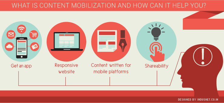
Content mobilization refers to the process of bringing your content to mobile devices such as smartphones and tablets. With mobile traffic easily displacing traditional desktop-based traffic, it is already considered late if you haven’t made it to mobile space. If you haven’t already started mobilizing your content, it is imperative that you start today. Readers and users always have their smartphones and tablets with them, more than they have their desktops. In emerging countries like India, Brazil and certain countries in Africa, people access the Internet only through cellphones. This means, you have to bring your content to mobile platforms without any delays. However, it is not as simple as creating a mobile version of your website and forgetting about it. There are a few things that you need to consider before you begin content mobilization. In this article, let us take a look at what you could possibly do to ensure that it is a success. 1. Get an app First and foremost, you may need to have an app developed for Android and Apple’s iOS devices. This helps you to break free from the clutches of limited real estate that mobile devices provide. Getting an app helps you to be more accessible to your users and also notify them when you need to. Apps are slowly but surely replacing the importance of browser-led traffic. Getting an app developed will continue to grow in importance until it will replace browsers in an overwhelming way. 2. Responsive website Your existing website should be mobile-compatible. A website need not be built from scratch alongside your desktop website. Instead, get your website designed in a responsive way so that it appears attractive on all screen sizes no matter which device your user is using. A responsive website adjusts itself depending on the size of the screen on which it is being used. This is also considered to be an SEO-effective strategy as Google recommends using responsive websites over other formats. 3. Content written for mobile platforms Content must be specifically written for mobile platforms. You probably will not want to write lengthy blog posts unless they make sense. As screen sizes are smaller, people will prefer to read for a shorter time. Also, including gamification and other techniques will help you to tap your target audience in a better way. Content that is written specifically for mobile devices is attractive to read, crisp and short in nature. It is important to bear in mind that content should not have far too many links and images so that the page loads quickly. 4. Shareability Mobile devices make it very easy for people to share information with their friends and family. This means, share buttons and short URLS should be easily accessible for your app or mobile website. Speak to your developer about how you would like your share buttons and on which social networking sites you want your content to be shared. It is a blessing in disguise that your content will be shared across platforms. Based on the kind of audience you have, you can decide how to place those share icons. It is important to make your content available on email as well, as many people still share content on emails. Looking forward Content mobilization is not an option but a necessity. People are no longer discussing how to bring content to mobile devices and why they must do so. The conversation is now about how to make up for the lost time. If you are in a similar position and would like to start content mobilization soon, speak to one of our executives so that they can take it forward.