Category: Design

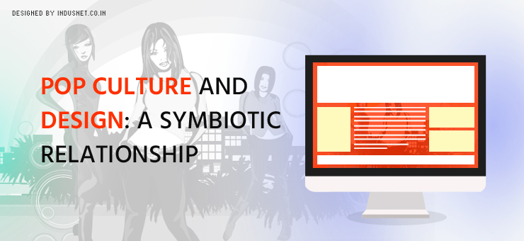
Pop Culture and Design: A Symbiotic Relationship

Pop culture can be defined as the sum total of images, ideas, stories, attitudes, and perspectives of a given period in a given culture. Pop culture is a term that is used to describe western pop culture, more than any other. It is usually influenced by the mass media and one usually hears about it through movies, music, TV, sports or news. It could also include certain words or slangs, technology, politics or fashion. It could include anything that is trendy. What constitutes pop culture in the realm of technology? We can say, certain web design trends such as the black background, white spaces, parallax and infinite scrolling are part of the popular culture. For example, when we visit a website that is black in the background, we immediately think of either a luxury product or a naive website designer. When we look at infinite scrolling or parallax, we understand that this website was probably designed recently. In fact, using certain technologies, color, design aspects or even web content can be a reference to pop culture. This is important in order to connect with your audience. If you know which pop culture your audience leans towards, you can make references to it implicitly or explicitly in what you create. It can easily be argued that pop culture and design have a symbiotic relationship and that one influences the other. Today, some of the most common design trends that have entered pop culture are responsive design, Omnichannel business model, and mobile applications. While these may be seen as technology trends, people understand these quirks as something that represents a certain period in history. Just like we associate with floppy drives with the 1990s and MySpace with early 2000s, we may associate responsive design with the current decade. The importance of designing for a context in pop culture When it comes to design, it really is all about the context. Context is also important when we market what we design. Context should be borrowed from pop culture so that it appeals to a wide range of the intended target audience. For example, if you plan to design a website that is targeted at millennials born before the 1990s, you might want to borrow pop culture references from the 1990s, during which they grew up. It is important to know what references we are making when we create something for our audiences. One should never design anything without knowing the context in which it will be viewed. For example, most websites are not those that look great. They are the ones that have been designed for a particular context. These contexts can be derived from the knowledge of pop culture. Conclusion Whenever something is being designed, whether a product or a website, it is important to see in which context it shall be viewed. When you analyze the context before designing, you will be able to create something that is more symbiotic in nature. After all, pop culture and design are mutually dependent on each other.      

Read More »

Web Design and Aesthetic Trends in 2016

Web design has come a long way in recent years. With the advent of the mobile internet and wearable technology, the way we imagined websites has completely changed. Now, people are designing websites with a mobile-first approach. Yet, each season and each year, the way we design websites changes. These design and aesthetic trends are influenced by a number of things, including pop culture. They are also influenced by the context in which the website shall be used. Yet, it is common to see certain trends that will be followed by most designers in a certain period. In this article, let us take a look at some of the design and aesthetic trends that will be popular in 2016. 1. Being different One of the most important trends in 2016 will be to scamper and try to be different. There will be a lot of requests from clients to make their websites different from the rest of them. The search for authenticity will continue in the web design space as well. While technology has not changed much in the last few months, the requests for making websites appear different will increase. 2. Graphic illustrations While images and videos ruled the roost in 2015, there will be a trend to create graphically rich illustrations. Hand drawn or painting based illustrations may be used instead of stock photos. There is already a tendency to revile stock photos and these images will be replaced by paintings and art. 3. Micro-interactions The point of designing websites in 2016 is to create web pages that are as interactive as possible. There could be mini pop-ups that are not really pop-ups. They are just micro-interactive. There could be many interactions within mobile and desktop spaces that they will all add up to the final experience. 4. Flat design Minimalism, simplicity, and flat design are here to stay for a long time. This was a trend seen in 2015 but will continue to be popular in 2016 as well. More clients will continue to request for simple websites that focus on typography instead of a lot of features that may end up confusing visitors. 5. Responsiveness There is no denying the fact that mobile devices and wearable technology are moving ahead. With this in mind, responsiveness and omnichannel business models will continue to increase in popularity. Responsiveness allows users to view websites that automatically adjust to the screen size of their devices. This enhances user experience and will not limit a user’s processing of information even if the screen size is small. Looking forward Certainly, there are quite a few design and aesthetic trends that will be carried forward from 2015. Responsive technology and flat design are two of the trends that will continue to remain popular in 2016. However, there will be an increasing focus on being different, introducing art and paintings into illustrations and enhancing micro-interactions, within websites. These are the trends that will likely dominate this year when it comes to designing websites.

Read More »

7 Unconventional Ways to Use Landing Pages

More people are warming up to the idea of using landing pages these days, and that is a welcome sign. Still, we have often seen people are not using landing pages creatively. A landing page can be an effective first point of introducing yourself and getting that elusive email address of your prospects. However, it is not enough to just create a landing page, make it look attractive with graphics and call it a day. Thankfully, there are a number of creative ways with the help of that you can use landing pages to boost your business. Some of these tactics may seem unconventional but they have to be so. After all, it is only the one who wades deeper and farther into unknown waters who will be able to discover new fish. In this article, let us take a look at some of the more unconventional ways to put landing pages into use. 1. Use landing pages to attract people to events Events are some of the most functional ways to attract prospective clients to your doorstep. You may even choose to run an online event, if you do not have an office or if you do not plan to hold an event physically. Webinars, online conferences, and Tweetups can all function as events that can be used to look for prospects. The best way to get people to attend these events is to first run them through the landing page, which will not only orient them to your company but will also help you to collect their email addresses. In fact, there is nothing better than an event to create some buzz online and offline. 2. Use landing pages to give surprising information about your company A landing page is supposed to provide some sort of information to the visitor in exchange for an action that he might take. Usually, companies provide information about their products or services, or they may choose to provide information about themselves or their companies. This is a very common strategy used by page creators. However, if you chose to provide information that will surprise or even shock your visitor, you will have their attention. It is important to give little-known but useful information about your company, products or services if you wish to grab the visitors’ attention. 3. Use landing pages to thank existing customers There is something really impressive about a simple ‘thanks’. When you thank your visitor for visiting your page or for having bought a product or service, they are likely to feel appreciated. With this appreciation, if you also give away a coupon or some kind of freebie, a landing page can double up as a lead nurturing initiative. This way, you will also know if your clients or customers are actively interested in visiting your web page. This literally means that they are interested in whatever you are offering and that you should continue doing so. 4. Use landing pages to provide multiple calls to action While it may not be a good idea to stuff your page with a lot of links, you can certainly have a number of calls to action for your visitor. It makes things easier and you may even be able to avoid multiple landing pages and monitoring all of them at the same time. Research shows that more than one call to action can actually increase conversions. It is often believed that when there is just one action to take, people may just not take it. When there are options with respect to actions they may take, people may choose one of them. This way, you will still be a winner because the visitor will have taken some action, most probably. 5. Provide a lot of information at one go It makes sense not to bore people with a lot of information. Which is why standard landing pages come with a short brief description and a call to action. However, is this really a good strategy? Probably not. It may be necessary to provide long-form content for certain kinds of readers and visitors. If your target audience is slightly older, it makes sense to provide more to read. This makes you look more credible, offers valuable information to the reader and also a chance to convert. Certainly, it is not a bad idea to have long-form content if your target audience demands it. 6. Provide very little information While providing a lot of information can be a good idea sometimes, it may also be a very good idea to provide very less. You could have just a one-liner that effectively communicates the message and provides a box to take action. This is a better strategy than providing information in the same length as your competitors do. What is really important is to remember who your target audience and design a landing page according to their needs. Most importantly, try not to be like your competitors who may be using more conventional landing page tactics. 7. Provide art If you do not wish to be like everyone else and have the same content, you can choose to offer art on your landing page. Art in the form of mixed media or just various types of media can be a welcome break from regular landing pages. This helps you to stand out from the rest of them and possibly earn a conversion or two. However, you need to bear in mind that art is not cheap and can cost quite a lot, especially if you commission well-known artists. Nevertheless, it is a good idea to showcase art on landing pages. Make sure you use landing pages Last but not the least, you should follow all the above unconventional ways to optimize landing pages and also ensure that you keep them updated and active. There is nothing worse than arriving at an excellent and unconventional landing page which is thoroughly out of date with respect to information. Ensure relevancy and you will be

Read More »

What Must Portfolio Websites Include?

A personal portfolio website has been around for a long time now but now they are becoming ever more important. Whether you are a student, a freelancer or a small agency, a portfolio website is the best way to showcase to the world that you exist and upload some of your work for them to see. A good portfolio website is sans distractions and does what it needs to do: tell that you are available for work. For this reason alone, most portfolio websites are the single page or sometimes even parallax websites. A portfolio website may also contain a blog that will help you to showcase your knowledge in your chosen domain. If you are a creative professional, it is very important to have a portfolio website. In this article, let us take a look at some of the rules you need to follow while designing a portfolio website. 1. Keep it simple A portfolio should most importantly be accessible to people and easy to understand. So, try and avoid anything that is not necessary or will make your site uncluttered. Use a template or design that is easy on the eyes, with a focus on text and your portfolio. 2. Have a logo Most freelancers may think that a logo is not important but it is. It helps people to remember you and also to associate certain color schemes with your website, which again helps them to keep you in mind. If you cannot get it designed by professionals, at least, hire another freelancer to do it. 3. Publish your ‘About Me’ page Use a story like narrative, that which will help your audience to form a bond with you. This page should list your achievements, your scope and also why you are good at what you do, in a narrative style. Hire a professional writer if you are unable to write it yourself. 4. Have a portfolio It is always a good idea to publish a portfolio. This helps your audience to understand what you are good at, what your caliber is and how you can finish the projects that will be assigned to you. 5. List your services Just because you have an About Me page or a portfolio published does not mean you should not have your services listed. Mention all the services you can offer and that will likely help you gain clients in ways you possibly don’t imagine. 6. A blog This is very crucial to a portfolio page. When you have a blog, you will be able to tell the world in your own voice why you should be hired and what makes you so special from the rest of them. If you are unable to write great posts yourself, you can hire professional writers for this. However, help them know the real you so that it is still your voice. 7. A contact page A contact page should include ways to contact and list your email, telephone number and if possible, an address. List your social networking profiles either in button forms or as links that will take them to a third party website. Important takeaways Portfolio websites are very important to make sure that you are available online and easily accessible. They help you to gain an edge over others with the help of SEO and also with the help of content marketing that you may engage in. Ensure that your blog is regularly updated and that your portfolio is published with the best of your projects. All this will help you to gain better clients as you move forward in your professional life.

Read More »

Are Achromatic Websites Boring?

Most corporate websites tend to stick to conservative colors such as grey, blue, red and sometimes yellow even. If you notice, there is a skew towards prime colors which are known to attract people’s attention. However, there is also a subset of companies that make use of achromatic shades. Achromatic shades include grey, black and white. Basically, they include colors that are not typically seen as attractive. There are a number of reasons why achromatic websites are a good idea. They make your text, videos and images stand out, especially on a white back ground. Moreover, it is known that large white spaces on web pages help people to read text better and also to process information that is published much more easily. Yet, we often hear arguments that achromatic sites are boring and melancholic. This is not really true. It depends on whom you are targeting and who the audience is. In this article, let us take a look at why achromatic websites are not such a bad idea after all. We will also discuss which might be the best situations to get an achromatic website. 1.      Black and white are classic It is a well known fact that black is a color that will never go out of fashion. Similarly, white is yet another color that will never go out of fashion. When you build a website using only these two colors as predominant shades, they stand out from the rest of the websites that desperately seek to attract attention with the help of bright colors. 2.      White spaces are easy on the eyes White spaces on web pages are known to increase readability. This helps people to understand your message without them having to spend a lot of time. White spaces are also great at helping people process information quickly. No matter what you publish on white space, it is like a blank canvas that helps your text or media to standout. 3.      Achromatic shades are stylish Black, white and even grey are considered achromatic colors that will never go out of style. This is true for websites too. Even after ten years, your website will remain classic and elegant. You will not have to worry about people not ‘understanding’ or ‘getting’ the color scheme you have chosen. Achromatic colors are simply easier to process and everyone understands them. 4.      Achromatic sites are less distracting Most importantly, achromatic schemed websites are less distracting to people. They will not stare at information that is not important to them. The fact that an achromatic website looks simple also means they will also look at your website as something that is more credible. It is a well known fact that people tend to believe simplicity more than complexity, because their brains process simple information more easily. 5.      Achromatic sites have a professional look As they look so simple and clean, they also look more professional than websites that typically come with many colors. This helps you to project an image that is professional, credible and trustworthy. At the end of the day, this is the image you should be looking at communicating to your audience. Certainly, achromatic websites are not boring While the fact that achromatic websites are not boring is true, you also need to look at who your target audience is. If you are dealing with an audience that needs to be motivated or energized, it might make sense to use bright colors that are likely to motivate them to take action. However, if you are not dealing with that kind of audience and are looking for style, simplicity and readability, achromatic color schemes should work very well.

Read More »

Is It the End of Desktop eCommerce?

We have been hearing from a number of reports that eCommerce stores have either shut down their desktop websites or they have largely scaled down their web operations in favor of apps. In India, FlipKart announced many months ago that it would phase out its web operations and focus only on its app. Similarly, Uber and Ola, which are GPS-enabled taxi aggregators, operate only through applications. An increasing number of eCommerce stores no longer consider building a website but focus on apps. While this could be seen as a prevailing trend, it certainly does not spell an end to desktop eCommerce. There are many reasons for this. In this article, let us take a look at some of the reasons why desktop eCommerce is here to stay, and how it is only going to support app based eCommerce in future. Neither is mutually exclusive and both forms of eCommerce will help companies to target different audiences at different times. Certainly, it is important to bear in mind that desktop eCommerce as we knew it may have changed, but it certainly is not the end of it. A large percentage of people still use desktops While the statistics may tell you that it makes no sense anymore to have a desktop store, the reality is quite different. Most people who have purchasing power still invest money in Macs and PCs. this is because, they tend to be more educated and affluent, allowing them the money to invest in larger computers. When there is a desktop or a laptop around, people are more likely to make purchases on it. It is easier to compare products on a large computer Even people who prefer to shop on their mobile phones usually compare several products on a computer. This is because of the sheer ergonomic benefits that a PC or Mac provides. It is easier to compare, list and add products to favorites than on a mobile application. Of course, a lot depends on how a website is built and how an app is developed. Yet, we cannot ignore the fact that laptops and desktops are more ergonomic to conduct searches. Mobile eCommerce is not mutually exclusive with desktop eCommerce Just because a large percentage of people use their mobile phones to browse does not mean you should automatically consider desktop eCommerce as redundant. On the other hand, neither is mutually exclusive and both can have a symbiotic relationship in helping to grow your eCommerce business. At the end of the day, it really is more important to ensure that you have responsive websites and applications which work together, and not separately. Desktops will create a niche It is more likely than ever that desktops and laptops will become the choice of device for professionals, artists and those who need to work a lot. We are already seeing a trend where designers prefer Macs. Such a scenario will make it easier for you to design desktop eCommerce websites that are targeted at certain specific populations while mobile apps are targeted at the masses. What to expect in future If someone tells you that desktop eCommerce is coming to a grinding halt and that there is no future for it, they are obviously mistaken. It is a more prudent and wise thing to do if you are able to find a balance between your desktop and mobile eCommerce operations. This will help you to target both the specialized niche audiences and the masses. Last but not the least; ensure that your websites and apps follow the responsive design protocol.  

Read More »

How WordPress Customization Can Solve Problems for the Budget Constrained?

WordPress is the most commonly used and easy to install content management system employed by bloggers. There are many default modules and themes available in WordPress that helps in starting a website within minutes. But if you want to create a unique website, it is always recommended to customize WordPress. Customization results in a unique theme with design, features and content management tailored to your needs. Customization gives you more control over your website and you can change every section of the website to suit your specific business needs.  It is rather the best choice to revitalize your existing website, add value and increase traffic and conversion rate. Web design, development and digital marketing trends are evolving rapidly. Meeting growing demands of visitors and gaining an edge over your rivals can only be achieved through customization. Furthermore, customization ensures repeat visits and smooth operation of website. Benefits of WordPress Website hosting on WordPress is loaded with benefits.  It gives you a variety of tools and utilities to customize your website.  Pre-set design doesn’t work for specific needs. WordPress is well-documented and has a huge support community. Custom theme can be designed in any manner as you are free to experiment. But you have to be careful as poorly coded themes create a problem in the long run. Moreover, customization is not a one-time task. You require periodic customization to avoid anachronism, maintain up-to-date security, add latest features and functionalities, keep it engaging, user-friendly, and business ready.  Obsolete websites are at a higher risk of attacks from hackers. Though creating a basic website is not a tough task, you need a dedicated team of WordPress developers who have thorough knowledge about design and development for a creating an advanced website. The problem with premium and free WordPress themes With a pre-designed theme, you can’t be sure whether the code is clean or not. And then you are worried with a long list of questions. Does it support core functionalities of your business? How do you troubleshoot? What is the frequency of updates? Even if you get satisfactory answers, you will always feel restrained owing to limited customizability. Many business owners don’t mind shelling out $100 to buy a premium WordPress theme from great resources. While others look for a free theme that matches closely with their business needs. After realizing dissatisfaction with these default themes, many business owners turn to designers and experts to turnaround their themes and make them more usable. Unfortunately, this exercise goes in vain and they are stranded. The best way out to this problem is to create one-of-a-theme from scratch to be happier in the long run by realizing full potential of your website. Most small business owners have a limited budget for website creation and they don’t want to go beyond that. It is important to note that customized solutions do cost more than the default solutions but it assures that you don’t have to spend more money in overhauling the website owing to a poor design. Poor design engenders loss of business and customers. Even though you have had a budget constraint, you end up spending more in frantic alterations. There is a difference between alteration and upgrading your website. While alteration may involve massive rework on the website; upgrade means building upon existing functionalities of the website. The following article will enlighten you about the importance of a customized WordPress solution. Importance of WordPress Customization Create a customized design and layout to gain a better control A template does help you to create a website, but it is not something what makes you unique. Many businesses use a template and fail to differ from their competitors. Spending a little money to create a custom design will go a long way for your business. Visitors remember you as you are able to offer them a unique experience. With customized design, you can choose various aspects of design to meet the needs of your target audience besides reflecting your personality into the website. As a good marketer, you must look up to create a unique browsing experience for your customers. A website owner can control every element of the page through customization. You can choose how images are displayed and have the ability to change font size and color. You can also have a custom-coding in sidebars. Having a control on slider lets you adjust height, width, text, images, speed and links from images. Blog excerpts displays, footer displays and contact form options are just the way you want it to be. The website layout is completely under your control as you can design home page layout, page to page layout and blog page layout. You can’t enjoy a similar freedom with templates. Customization is really helpful and is a mark of conscientiousness. Clean coding: getting rid of unnecessary coding Clean and lean code is necessary to improve the interaction of your website with search engine algorithms. And it is critical to have your website working on all browsers and mobile platforms. Clean coding done by an experienced developer is a must to skirt errors and operational problems on your website. Even the templates don’t guarantee a clean coding; in fact coding is often overlooked while choosing a template. Moreover, many templates have a poor coding that interacts negatively with certain plug-ins. With clean coding, all your worries about plug-ins are put to rest and developers can do without one. Highlight your brand As businesses go online, website design forms the foundation for the brand. Whether its brand logo, brand identity, corporate identity, brand personality, color design or visual style; a customized design can incorporate everything. All these brand elements are there on the screen forever as long as the visitor stays on your website. A customized theme is branded with your brand name and not any theme designer’s name. As a business owner, it is your responsibility to put forth and promote your brand in every design element of the website and you

Read More »

Bringing Back Readability to Web Design

Text readability has to be a priority in web designing. Even an interesting piece of content will not be effective in its delivery if it is not readable. Readability does not mean that the text is illegible but that it takes time to read the text. If visitors have to struggle to read the text and read between the lines to understand what they are trying to know, they’ll soon abandon your website and look for other sources. A text web page is not a textbook or an offline MS Word article where visitors would like to sit through longer duration to comprehend the content. Netizens often lack patience as they are in a hurry to grasp a lot of information in minimum time. Text still dominates Despite evolution in content delivery through infographics, explainer videos, eBooks, images, audio books etc; text continues to occupy the central position. All other mediums are secondary and supportive components. Text is required to elaborate a point. Many web designers have failed to recognize the importance of highlighting text resulting in a glum-looking incomprehensible web page. A good designer always delivers understandable content at a quick glance. Easy to read pages always find more acceptance among visitors and consequently, brings more traffic to your web site. This clearly indicates that designers must keep in mind the visual perception of readers while designing a web page. There are many factors to why readability suffers on a website and this article is going to discuss all the necessary factors required to make a web page more readable. 1.      Optimum line length Line length is an essential criterion when it comes to rating the readability experience. The optimum line length for web is considered to be 50-60 characters. Readers experience inconvenience if the line length is too wide or too narrow. A wide line length will sap the concentration of the readers as they will have to browse through longer lines and end up jumping to the wrong line after one line is finished. On the other hand, if the line length is too narrow, readers again feel distracted as continuous shift of lines becomes exhaustive and breaks the reading rhythm. Fixed width will not be able to adapt to multiple screen sizes existing today. While liquid layout will be too flexible by adjusting to varying screen sizes but generating random line lengths. For that reason, it is always advisable to adopt a semi-fluid layout which adapts to readers’ screen besides retaining sufficient control over the width of text blocks to ensure optimum line length. 2.      White space is good White space is the space between the elements of a web page. Many designers do not realize the importance of white space in design thinking that it is waste of space. On the contrary, it is purposely left to enhance the user experience. White space also refers to the space between the letters which may vary depending upon the type of font, font size and line spacing. The purpose of web design is to make things easier for readers. And by leaving white space, you are getting rid of cluttered pages. The reading experience becomes effortless and readers are more likely to stay longer on the page. 3.      Contrast To differentiate one element from another on a web page, it is important to use contrast. Contrast pulls reader’s attention and builds interest in reading. The page looks drab if there is no differentiation between different elements. Though many designers associate contrast with only color, apparently, it is much more than that. Designers can also bring contrast through alignment and size difference. There are different areas on a web page including header, footer and content area. You can bring in contrast through background color and font color to highlight a particular area more than the other. It is very important to concentrate while working with color combination. The background color should be starkly different from font color. If the color contrast is a limitation or a no-go for you then you can probably use different font size for different sections. Supposedly, there are three columns on a web page, and the middle column contains the most essential information, then you can use a bigger font size for the middle column as compared to the other columns. On the other hand, if your content is split in different paragraphs in row format, you can use a different alignment for different paragraphs. If used properly, alignment brings in interesting contrast and breaks monotony while reading. 4.      Type of fonts Web fonts have been limited to few safe fonts for a number of years but with the advent of @font-face and WOFF, designers have a lot of options to choose from and make their design attractive. Be selective while choosing a particular typeface in line with the content in picture. While choosing a font, you have to understand what works best on screen. Fonts like sans serif need to be optimized to improve their suitability with small screens. 5.      Line spacing While designing you get a line spacing of 100% by default. Some website owners may think it is the best spacing to accommodate more text in less area. But the fact is your web page looks crammed as it does not let the letters breath. Optimum line spacing for a web page is considered to be between 140% -160%. It makes easier for customers to go through your website. 6.      Focus on the content The purpose of web design is to improve the usability of your web page. And you can do so by delivering “to the point” content. Filling up your web page with too many details dissuades the visitor. Cutting out all the unnecessary details will enable the visitor to extract more details on a quick look. Use objective language as much as you can to hit straight at the point. Use bold format for keywords and important phrases. A long paragraph desist visitors from reading it

Read More »

What Is Content Mobilization and How Can It Help You?

Content mobilization refers to the process of bringing your content to mobile devices such as smartphones and tablets. With mobile traffic easily displacing traditional desktop-based traffic, it is already considered late if you haven’t made it to mobile space. If you haven’t already started mobilizing your content, it is imperative that you start today. Readers and users always have their smartphones and tablets with them, more than they have their desktops. In emerging countries like India, Brazil and certain countries in Africa, people access the Internet only through cellphones. This means, you have to bring your content to mobile platforms without any delays. However, it is not as simple as creating a mobile version of your website and forgetting about it. There are a few things that you need to consider before you begin content mobilization. In this article, let us take a look at what you could possibly  do to ensure that it is a success. 1.      Get an app First and foremost, you may need to have an app developed for Android and Apple’s iOS devices. This helps you to break free from the clutches of limited real estate that mobile devices provide. Getting an app helps you to be more accessible to your users and also notify them when you need to. Apps are slowly but surely replacing the importance of browser-led traffic. Getting an app developed will continue to grow in importance until it will replace browsers in an overwhelming way. 2.      Responsive website Your existing website should be mobile-compatible. A website need not be built from scratch alongside your desktop website. Instead, get your website  designed in a responsive way so that it appears attractive on all screen sizes no matter which device your user is using. A responsive website adjusts itself depending on the size of the screen on which it is being used. This is also considered to be an SEO-effective strategy as Google recommends using responsive websites over other formats. 3.      Content written for mobile platforms Content must be specifically written for mobile platforms. You probably will not want to write lengthy blog posts unless they make sense. As screen sizes are smaller, people will prefer to read for a shorter time. Also, including gamification and other techniques will help you to tap your target audience in a better way. Content that is written specifically for mobile devices is attractive to read, crisp and short in nature. It is important to bear in mind that content should not have far too many links and images so that the page loads quickly. 4.      Shareability Mobile devices make it very easy for people to share information with their friends and family. This means, share buttons and short URLS should be easily accessible for your app or mobile website. Speak to your developer about how you would like your share buttons and on which social networking sites you want your content to be shared. It is a blessing in disguise that your content will be shared across platforms. Based on the kind of audience you have, you can decide how to place those share icons. It is important to make your content available on email as well, as many people still share content on emails. Looking forward Content mobilization is not an option but a necessity. People are no longer discussing how to bring content to mobile devices and why they must do so. The conversation is now about how to make up for the lost time. If you are in a similar position and would like to start content mobilization soon, speak to one of our executives so that they can take it forward.

Read More »

Are We Focusing Too Much on Sliders and Parallax Scrolling?

A lot of web visitors often find it strange that every website these days comes with parallax scrolling and slider images. While these techniques are excellent for most visitors, certain people who are not used to image-rich screens feel alienated. People who have been using the Internet for decades and are used to textual content, often find it distracting to see images that slide and change. They also find it difficult to scroll down for all the information. What a web designer must consider If you are a web designer and were wondering if you should omit the parallax and slider features, think about it this way. Who are your target audiences’ and what do they want? No wonder that the Internet is changing and a lot of us will want to get our websites designed in a manner that is more in sync with our times. However, we may end up alienating certain niche groups that prefer to have a more text-based website that does not have parallax features. There is also another side to this story. Many newer web design companies and rookie designers go for parallax scrolling because that is the template you most often get. This calls for a completely different solution, which is, customized development based on client requirement. A lot of clients actually do know what they want and if someone is trying to shove parallax templates down their throat, it is easy to see why: parallax and slider templates are easily available and they are the “in” thing now. It is easy to alter these templates a little bit and sell it for a premium to the client. This is not only professionally lazy but also unethical. It is all about custom development One needs to understand that each design has its place. Parallax and slider features work well with a certain kind of web user. For another, it may be important to have the good old textual website that is more accessible. Understanding who is going to use the website and continuously customizing one’s website is the only solution. If we simply ignore sliders and parallax features just because they are too common today, we may risk alienating younger and trendier audiences. Thus, it is important to understand the target audience and come up with a design plan that is customizable in the future and now. Always remember to consider who needs what Parallax websites are great for companies that offer a few services or products. However, if your company is really huge, it might be a better idea to incorporate certain elements of old fashioned heavy coding. Moreover, sliders can be incorporated or discarded based on your requirements. The only way you will ever know if you should go for sliders and parallax scrolling or a more conservative design is by speaking to professionals who are well versed with advantages and disadvantages of both styles. If you have budget constrain, you could try and opt for a template that will suit your purpose. Otherwise, it is a better idea to choose customized web development solutions that will help you to maximize your web traffic and reap profits in a better fashion. At the end of the day, purpose of a website is to help you gain useful traffic that will convert to sales. For that to happen, it is always advisable to focus on a website that is designed specifically for the target audience. There is no such thing as parallax is not advisable or that sliders are a distraction. It is the purpose of the website that is more important. Web developers and clients must consider all these aspects before deciding on a course of action. If you need assistance, you could always speak to one of our professional developers who will be able to guide you.

Read More »
MENU
CONTACT US

Let’s connect!

    Privacy Policy.

    Almost there!

    Download the report

      Privacy Policy.