Category: Design

Why Less Is More, When it Comes to Web Pages: A Psychological Insight

Why Less Is More, When it Comes to Web Pages: A Psychological Insight It is common to see web pages that are minimalist and simplistic these days, but there are scientific theories behind encouraging sparsely designed websites. Psychological researchers believe that less is more, when it comes to online means of promoting a product. A group of researchers conducted a study wherein it was found that small articles in print media actually yield more response than big ads. Cognitive Limitations From a psychological perspective, the causation of this phenomenon can be attributed to a certain limit in our cognitive capacity when processing varied qualities of information at a given period of time. Human mind is capable of complex analysis of thoughts, information and opposing stimuli. However an overflow of information can lead to diminishing of cognitive processes eventually, even if it is not noticed initially. As a result of this, humans are programmed to register a certain amount of quality information and a tendency to leave out the rest. Information Overload Leads to Avoidance of Message Thus, adding a lot of information on a webpage or in an ad can lead to the reader either forgetting what he just read or becoming indifferent to the information provided, which is definitely not what the marketing professional wants. This fact is known and well established in print and audio-visual media, but in virtual marketing it is not so. It is still common to see online ads that pack in more flash images and textual content than they can fit and that ultimately leads to an information overload, leading to boredom or ignoring the message altogether. Subliminal Processing of Information “In your face” marketing will not only bore or annoy the target audience but will also cause information overload, which leads to possible customers just ignoring marketing messages. No matter how non-opinionated a person is, he or she would already have formed an opinion regarding a company or product because of subliminal messages. When a lot of information is provided in either the web page or in an online ad, it results in a barrage of information that is perceived to be intrusive subliminally. Lexical Comprehension Thus, ideally, web designers must ensure that a major portion of the web page is blank. Powerful meaning can be communicated when simple words are chosen over complex ones, when smaller sentences are used instead of lengthy ones and when less information is provided than bombarding viewers with images, text and videos. Lexical comprehension, which includes both semantic and syntactical understanding requires that an individual is not bombarded with strange syntactical formations. That means, a person should not be subjected to reading sentences that are formed in a complex manner. Similarly, complex semantics must be avoided by choosing not use complex words instead of using simple ones that can be understood by everyone. Simple Typography Web Designers must ensure that the typography they choose is simple, classic and timeless. It should never appear complex and there shouldn’t be even an iota of cognitive effort that is forced on the user or viewer. A good method is to make sure that a large number of people are asked to view the website and its content before it goes live. Similarly, an ad copy’s content and text need to be reviewed by several people to ensure that it is simple and minimalist. What Cognitive Psychology Tells Us about Minimalism It is important to ensure that web pages contain as little information as possible and have a lot of white space left blank. By doing so, marketing professionals and web designers will be able to attend to a viewer’s cognitive resources more efficiently. Following this method of design can be beneficial not only create an enigma or mystery in the buyer’s mind regarding the product but also helps in putting more space and reducing unnecessary hard work. When mystery is created around a product, an enigma remains in the buyer’s or viewer’s mind. Be it maximizing profits, minimizing hard work, or minimizing the buying of more ad space on a website, simplicity can save a lot of money, time and create marketing communications that are effective and aesthetically pleasing. Web designers and ad copywriters on the other hand will gain from understanding basic psychological principles behind minimalism, simplicity and the idea that ‘less is more’.
Read More »

Tumblr vs. Pinterest for Web Designers

The hottest social networking site right surely is Pinterest and it is known to drive a lot of traffic to websites. Tumblr on the other hand is a popular microblogging platform, which has been around for quite a while. There are similarities among both the services, and each works for different purposes, users and situations. Differences between Tumblr and Pinterest Tumblr is a micro-blogging platform that can behave like Twitter, act as a simplified version of WordPress and is a place to engage in discussion. Pinterest on the other hand is a visual bookmarking tool, that allows you to collect images and videos (and the links therein) on various categorized boards. Both of them depend more on media than text, but are fundamentally different. However, people do use Tumblr to collect pictures and images much like Pinterest. Both the tools can be astonishingly useful to web designers and developers. Let us compare the two services in order to understand which one could be better than the other. Team Collaboration Pinterest allows users to add contributors, which means collaborative collection of images found on the Internet or images that are originally taken can be easy. Pinterest can allow web designing companies to allow several designers to pin images that they like, in a form of visual brainstorming. Commenting and liking images, or pinning them back allows for socializing as well. Tumblr on the other hand is a fully functioning blogging platform that allows for lengthier discussions in the form of comments, and also in the form of text posts. As it follows a blogging structure, web designers can easily publish their strategies, ideas, tutorials etc easily. Collaboration in the real sense may be easier on Tumblr if we were to talk about combining blog posts, images, textual content and videos. Pinterest can be used as bookmarking tool or a place to showcase templates and designs you have created, before or after brainstorming. Marketing and Promotion Pinterest discourages self-promotion, whereas Tumblr doesn’t frown upon it. It is easier to promote oneself explicitly on Tumblr than on Pinterest. On Pinterest, you will have to use tricks and covert methods to promote your products or services. It might be a good idea to drive traffic from Pinterest to your Tumblr blog, where you actively promote your products. Pinterest has a majority of female users, where as Tumblr’s target audience is mostly youngsters. It depends who your target audience is before launching a marketing campaign. However, Tumblr seems to have a better marketing traction. SEO and SMO Both Tumblr and Pinterest are valuable SEO tools. They drive traffic to your company website, help you to generate organic traffic, and also achieve better search engine rankings. Interface Tumblr has more freedom to publish content, and doubles up as a blogging platform as well. Pages can be added and a simple website can be created within the Tumblr platform. On Pinterest, one can pin images found anywhere on the website, or upload original images and categorise them under various boards. Pinterest is more visually oriented than Tumblr, where as Tumblr is more of a publishing platform. Engagement, Discussion and Participation Tumblr allows better engagement and discussion. Thanks to its micro-blogging platform, it not only allows likes and re-blogs but lengthy discussions can happen in the comments section. Pinterest on the other hand allows commenting too, and images can be re-pinned or liked, but lengthy discussions are just not great enough. Web designers who need to discuss projects, tricks and tips, cheat sheets would do better on Tumblr. Web designers who need to showcase their templates, and basically offer visual eye-candy would gain more on Pinterest. Handling Design Projects Web designers can collect templates they like on Pinterest and also pin websites, portfolios of other designers and logos that they come across while browsing the web. Pinterest can serve as a place where web designers can find all the images that inspired them to design their own website. Tumblr on the other hand can be used to promote and market one’s own design projects. It could also be used to upload HTML5, CSS and other coding files in order to discuss with clients or team members. It serves as a collaborative, publishing and media sharing platform, all put together in a minimalist environment. It all depends on which part of the designing process one is handling. Both the tools are equally important and are not mutually exclusive.

Read More »

Web Designers vs. Web Developers: The Real Showdown

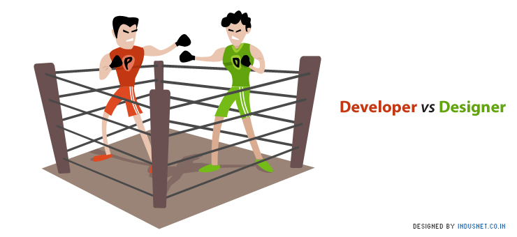
One of the often repeated sagas in the world of web designing is who is better, the web designer or the developer. Turns out, many-a-times the web designers and the web developers too can’t decide and each believes his profession is superior. This clash of egos results in certain comical situations but mostly unfortunate incidents where if the two worked as a team, the end product (the website) would be much better. Who is a Web Designer? A web designer is responsible for the way a website looks and feels. He is responsible for the artistic, graphic and creative aspect of a website. A web designer is most approachable to the client as the client knows how the website must look. A designer thus uses certain web designing tools (Flash, Photoshop, Illustrator, Dreamweaver, etc) to play with layouts, colors and typography. Web designers are responsible in making a website unique and special, standing out from the rest of the competitors. Who is a Web Developer? A web developer on the other hand makes sure that the engineering of the website is done right. A web developer uses advanced coding, programming languages (C++, Java, PHP, etc) and other techniques to make a website functional and usable. Web developers are less concerned with the creative aspects than the functional aspect of a website. A web developer makes the website ‘happen’, based on what the designer hands out in a PSD file, for instance. Stereotypes of Web Designers and Developers Everyone has heard of the nerdy and geeky developer, who sips gallons of coffee, doesn’t trim beard for days and is slightly asocial, when compares to a designer. A web designer on the other hand is stereotyped to be creative, trendier and more social of the two. These stereotypes unfortunately are played by the professionals themselves, without realising that they are falling victims to ego clashes, which are certainly not necessary in a team. Do take a look at what the professionals themselves have to say about their professions! Also, take a look at an infographic that describes the stereotypes about web designers and web developers. Thus, one could say that a web designer takes care of the designing and creative part, where as the developer takes care of the coding, programming and functional aspects of a website. Both are crucial for a website to work the way it should, and look the way it should. Reasons of Conflicts between Developers and Designers There are many reasons for conflicts between web designers and web developers. There are certain communication gaps and ego clashes that work against working in a single team. Moreover, designers tend to be more creative and find coding and functionality self-limiting. Developers find creativity and divergent thinking radical, and contrary to what they believe: stability and functionality. These basic differences in opinion, attitude and ego-clashes result in most of the conflicts between the two. For instance, developers find it difficult to work with Flash files and designers may not want to work with HTML and CSS because they are not used to them. Designers also tend to be slightly less organized than developers, who almost tend to be OCD personalities. For instance, developers may find it very infuriating to work with unnamed PSD files with several layers. Lack of communication gives rise to most of the conflicts between the two. Take a look at this argument by developers about why they think they are better than designers. However, such arguments need introspection, and only working together can create great results. Advantages of Conflicts and How they May Help in Projects Conflicts always need to be resolved, and when we talk about conflicts between designers and developers we must understand that there are possibilities for opportunities. There are also certain advantages to these conflicts. A dreary argument between a designer and a developer may lead to brainstorming. Brainstorming usually results in clarity of thought and acceptance of difference in opinions. Thus, a conflict may help to increase creative energies and result in a successful project. How to Minimize Conflict and Work Together to Create Great Projects Patrick McNeil, the content director of HOW Interactive Designer, is the author of The Designer’s Web Handbook. The book helps designers to deal with issues they encounter while web designing. It also helps them to tackle issues that they may encounter with developers. He maintains that both of them need to work together, and each can’t do without the other. The best way to minimize conflicts is to communicate. Communicating what seems to be infuriating can give rise to a number of solutions. Moreover, one must also accept that it isn’t possible to do without the other and both web developers and designers need each other no matter how different their thought patterns are. Designers + Developers, Designers vs. Developers

Read More »

Designing Websites and Products that Evoke Positive Emotions

Cognitive science helps us to understand that there is more to consumer decisions and choices than just good products. While good products and designs are fundamental to their own success in the market, certain choices and decisions made by consumers are not limited to the intellectual quality of a product’s benefits or superiority over others. Design’s Underlying Cognition Psychologists believe that consumers make decisions on an impulse, and the attitude and opinions they develop towards a company, its products or its designs are largely based on their own life experiences, mood states, emotions and certain personality characteristics. One could say that psychological processes like perception, memory, emotions and cognitive schemas play very important roles in consumers’ decision to purchase certain designs and reject others. Jeroen van Erp, co-founder of Fabrique, a multidisciplinary design agency proposed an inverted pyramid model that depicts designers as having the responsibility of creating aesthetic products which provide meaning and evoke emotions in consumers. It is a role that is perhaps more profound than that of an entrepreneur’s, whose job is to profitably sell his products. Psychologists also emphasize that many purchases are emotional in nature, and attitudes are formed when there is an emotional reaction towards a product, when certain memories from past life experiences elicit strong emotions in consumers. These emotions are elicited when a consumer encounters certain product or a design. Emotional Design: Why We Love (or Hate) Everyday Things by Donald Norman explores the underlying psychological process of buying. The book helps designers and manufacturers to understand why it is important to consider emotions, perception and other cognitive processes while creating websites or designing products. Emotional Designing for an Internet Driven World In a world that is dominated by ecommerce and web-driven marketing, a company’s website becomes an intermediary between products and services and consumers who purchase them. A well-designed website has the ability to capture and sustain a consumer’s attention, and this attention can be translated into a positive perception if the design or layout of the website attempts to do so. Perceiving a website positively usually results in processing of that positive information and associating it with positive life experiences. For instance, a website that is designed aesthetically may encourage a consumer to associate those colours with an art class that they took in school, which probably was a very positive and satisfying experience for them. These positive memories evoke positive emotions and mood states that help consumers to associate that particular website with joy, satisfaction or even self-actualization. Emotional Designing for Webpages If we are talking about how one could elicit positive emotions when designing a website, one must understand that the web page is akin to canvas. The canvas can be ‘painted’ with aesthetic images, contours and colors. Intuitive navigation and task-oriented functions are processed by visitors as credibility, trustworthiness and security. These perceptions evoke positive emotions that may translate into loyalty and continued visits. Of course, positive text and careful usage of words, avoiding jargons and not being circumstantial and tangential allow for information to be rendered in an aesthetic manner. Apps and Emotions While designing web or mobile applications, similar psychological and cognitive themes can be applied. An intuitive interface, colors associated with trust, simplicity and minimalism, and reduced clutter in app design help in evoking positive emotions as well. Using minimalism, intuitive layouts and contours, and elegance can help in evoking positive emotions from products and devices as well. Thus, a designer must bear in mind to consider aspects that have direct emotional consequences. Tapping Sensual Responses Sensual stimuli that activate visual, tactile and auditory receptors usually evoke emotions. Products and websites must be designed to please the eye. If possible, websites can have audio in the background and touchscreen capabilities of applications and websites allow for tactile stimulation. It isn’t possible yet to tap olfactory (smell) and gustatory (taste) responses when designing websites, but one can’t predict the future! Emotions are strongly connected to social situations and thus anything that can be shared, help in starting conversations and be an extension of consumers personality always help. Thus, designing for emotions is to remember that customers can and do make decisions based on feelings, impulses and mood states and not based only upon rational arguments and logic.

Read More »

SEO Trends in 2012

The web has played a major role in expanding business today. And becoming visible to people who matter, is the priority of all business. Search Engine is the key for online visibility as people use Search Engines to find the relevant thing they are looking out for. SEO or Search Engine Optimization is the technique using which the visibility of a website can be improved in Search Engine and rank it higher in Search Engine Result there by placing it on the FrontPage for a keyword. SEO helps in putting one website above others so that it will be noticed and the searcher will click on it and visit the website. When we talk of Search Engine Optimization, we keep in mind that we are talking about Google. With 84% market share Google is the leader in Search.  The business of Search Engine Optimization is quite fickle because of the ever-changing methodology Google employs to rank websites. In SEO it is difficult to predict what will work and what will not because of this frequent changes in the backend algorithm. What is working today might not be as relevant tomorrow.  So a good SEO professional should be well acquainted with changing trend in SEO and keep himself/herself updated with what is coming in. With that in mind we present below few of the expected trends in SEO for 2012. Humanized ranking Whatever automated techniques are implemented to rank sites, nothing can beat it when actual readers start ranking the websites. This way only the really relevant sites will be ranked and appear in the front page of Search result. Search engines like Google have realized this and have resorted to this way for ranking sites. So what is the implication? Link buying, swapping and baiting will rest in peace for ever. Social Media Social media in 2012 will have major impact on Search Engine rankings. The Search result page will contain more and more of social media mentions. The Facebook, Twitter, LinkedIn and Google+ profiles and brand pages will have bigger roles in search engine rankings. For this the SEO strategy should be inclined towards social media. Your presence in social media should be strengthened and enhanced. Share only relevant information in your social network to catch the attention. Also number of Tweets, Facebook Likes and Plus ones can have impact on the SEO. Posting quality and relevant information will draw the attention and will garner more likes, tweets and plus one. While searching for Abhishek Rungta in Google, the 3 results in top 5 are from social network sites like Twitter, Facebook and LinkedIn. Quality and not Quantity Earlier it was thought that longer articles with lot of keywords help in ranking. So it was a trend to write long articles with keyword stuffing. These are considered spam by Google with the recent Google Panda update. Many content firms have been penalized and are still trying to recover from the effect of Google Panda. Those with quality content saw an increased in traffic and rankings. Google is refining the Panda algorithm more with every updates, so that searchers will be able to reach to sites with quality content. So the SEO strategy should consider having Quality, relevant and informative content. Mobile Search The growth in Mobile usage has been tremendous. Introduction of Smartphone at affordable prices is strengthening it further. People prefer to search for information on mobile devices because it is easier and faster and always at reach and give better result in some cases as it employs localized search. So the mobile search market has huge opportunity in 2012 and in coming year. It’s high time the SEO professionals should start consider optimizing the sites for mobile search and the businesses should relook at their mobile strategy. CRO will be the buzzword CRO stands for Conversion Rate Optimization. This means converting your visitors into customers. If you are running an online business, then you can understand the importance of qualified traffic. These are the actual visitors who actually convert into customers. The site needs to be overhauled to engage customer and spend more time on the site. The call to action buttons need to be placed at proper location. SEO aimed at converting qualified traffic to customers will be the order of the day in 2012. Voice Search With Siri from Apple and Google Voice search it is easier to see where the web search is moving. Instead of browsing through a lot of result people tend to look for a direct answer when they are searching for something. Siri has been able to address that to some extent in its infancy. It usually relies on few sites to find the result. So SEO professionals concentrate on how to optimize the site to be in the purview of those sources. In future this new search technology is definitely going to replace all other kind of search. Personalized Search Most of the search engines are now displaying personalized search result. The search result now shows result recommended by people in social network. This can be tested by searching for something while you are logged in to Google and while you are signed out; you will see 2 different sets of result. With recent release of Google’s Search plus Your World, the personalized search has gone to a higher level. Decline CTR for Top Rank A study shows that In 2006, a no.1 rank in Search result used to enjoy a CTR of more than 42%, which declined to 34.5% in 2010 and in 2011 further down to 18.2%. This decline is due to many factors like organization of Search result page, introduction of search technology like Universal Search and Instant search. SEO should digest this hard fact that the value of top ranking is going to decline further. Rich Snippet Snippets are the 2 lines of text that appear below the site Title on a search result page. This is very important, as it provides a gist

Read More »

Logo Design: What Goes in Making a Good Logo?

Most designers encounter clients who need logos to be designed for them. Though a logo is a tiny piece of art, it carries more weight than reams of pages. What Is a Logo? A logo defines and describes what a company stands for. A logo helps people recognize the company as a different entity from its competitors. It inspires trust, familiarity, loyalty and a certain sense of superiority. It helps define a company as a separate commercial, legal and economic identity which has a place of its own in the world. The shapes, colors and fonts used to create a logo are always different from every other logo that has been designed. Thus it is no surprise than many companies sue each other when their logos appear similar. While a logo does not directly market or sell, it identifies the company as a commercial entity and its products as being separate from others in the market. One could say, that a logo is a signature of a company. What Makes a Good Logo? There are several ways to make sure that a logo is exceptionally good. A good logo has to be graphical in nature, and minimalist. A simple design always attracts and holds more attention than an intricate design that requires greater span of attention. A good logo has to be appropriate for the audience of the company’s products and services. It also has to be distinctive and practical. Logos may have to be printed on a number of merchandize and thus they have to be simple, accurate and easy to recognize. Any logo that is good has an implicit meaning or a message that is conveyed in a unique unstated manner. Even without colour, a logo should be able to stand on its own just because of its shape. It should be designed in such a manner that it can be replicated in any size that the company wants to. Thus, a good logo comes with a good concept and good execution. The Process of Logo Designing Designing a logo cannot take place haphazardly. It requires a certain discipline and the ability to stick to a process. The process involves a design brief, which involves interviewing the client and asking them to answer questions. This may include such elements as what meaning they try to convey through their logo, what the company’s goals, beliefs and ethics are all about. Once the brief is ready, it is time to do the research. A research must include deep insight into the industry that the client belongs to, and the company’s history and also its competitors. Having a reference, which is usually cultural in nature, is always good. Logos should be consistent with contemporary themes and beliefs. It should be recognizable as defining a certain quality. Once all this is done, designers could begin with the actual process of sketching and conceptualizing. Once a logo has been conceptualized, it can be sketched and created on the computer. In between the logo designing process, one needs to wait and reflect on what has been done so far. It allows the designer to think, introspect and come up with newer ideas or ameliorate what has been done already. This step leads one towards revisions and positioning. This helps in explaining the logo to the client, and also building lasting relationships with them. The best logos can then be presented to the client in PDF format or in any manner that may be convenient. Logo Designing Principles While this process is common to all kinds of logos, a logo designer must also bear in mind that the profession of designing logos stands upon certain principles. These principles can be understood in the following manner: Simple: A logo must always be simple, and should have minimalist sub-themes. It should not cause cognitive dissonance among the target audience and should be clutter free. Memorable: A logo should be remembered easily. It should have geometric and recognizable patterns so that the company can be easily associated with the logo and remembered as well. Timeless: Though a logo should be contemporary in nature, it must also be timeless. This only means that shapes and patterns that are chosen must be consistent across classic and contemporary periods. It always helps to be a little conservative when it comes to logo shapes. Versatile: A logo has to be adaptable, and should be able to fit in any place it is printed on. Appropriate: It goes without being said that logos should not be profane or provocative. They should not hurt anyone’s sentiments and should be neutral in nature. It should also be appropriate for all sections of the society. BTW, If you have a logo to be designed, feel free to drop us a line and we will be happy to connect you with our Logo Design team.

Read More »

Best Practices for Creating an Effective Web Form

Almost all websites need some kind of form to be filled, either for membership or registration. Sometimes, these forms may be required for voting or choosing certain functionality as well. While it is easy to create forms using HTML, visually attractive forms are not very easy to create. What Are The Must Have Features Of A Web Form? It is very important to make sure that web forms are visually attractive, and that they finish the form completion process as quickly and as efficiently as possible. There are several reasons why a web form has to be at its best. People’s attention span is very short. When they realize that they need to fill in a form to access what they want to, there are chances that they actually give up their goal and close the page altogether. The idea is to understand that people do not like filling forms, and thus it has to be as short, concise and simple as possible. People’s visual attention is centred on a vertical line and they always need to know how the job could be completed in less time. Thus, web forms should be lined up in an aesthetic manner. The submit button must be attention grabbing but be simple as well. No one likes to see endless and lengthy forms that don’t get over until one scrolls down for a long time. To make the form filling process easier, one should really know what information is being collected, and how the information collecting process can be simplified. One must also try and allow auto-filling of forms so that people can use their custom auto-filling software in order to fill as many details as possible. Arrow marks tell the visitor which direction he needs to click further to reach submission button, and progress indicators reveal how best to communicate the position, scope and status. Web Form Validation: Why It Is Necessary Of course, people do fill forms when they really need to move ahead. However, they may also enter wrong details and information. This is one of the reasons why web designers must consider web form validation. The idea behind web form validation is to make sure that users provided the right and properly formatted information in order to proceed further. It also makes sure if a user provided all the necessary information without missing anything deliberately or otherwise. Inputs that users make can be validated in two different manners. One is to validate it on the client’s (web browser) side, and another is to validate it right on the server side. When validation takes place on the server-side, information that is sent to the server is validated with the help of a server-side language. If it fails, the error feedback is displayed on the client’s screen. It is a secure method which works even if JavaScript is turned off. However, it takes a longer time to load and refresh. While server side validation is good enough for secure form validation, for a better and richer user experience, one might want to use client-side validation. However it relies on JavaScript, which is not always a preferable method. However, by combining both server-side and client-side validation, one could get a faster response, secure validation and amazing user experience. Ten Best Practices To Keep In Mind While Designing Forms Can Be Listed Below: Must be visually attractive and simple. Must be as short, concise and crisp as possible. Formats must be defined prior to creation of forms and it is always not a good idea to be very strict with them. Sometimes, users may not want to care about upper case or lower case as much as a web designer would. Passwords must always be confirmed, and once a form is filled it is a good idea to allow the user to confirm if the information is correct or not. Once information is validated, feedback should be given in a supportive manner. It is always a good idea to let validation take place upon submission of information in the form. Lesser the time, better is the user experience. If possible, using real-time validation is a much better option. If possible, OAuth options could be used as well, wherein clients can use Facebook or Twitter to fill in forms, if they are logged in. Combining server side and client side validations. Using HTML5 instead of flash-heavy pages. Some Of The Factors That Must Be Avoided Are: Single error pages are not pleasant. Once a form is filled and submitted, users would have to press the back button if they want to fix errors. JavaScript popups can be avoided. Lengthy and redundant forms have to be done away with. Textual forms look cluttered. It is better to have forms that are graphically rich instead. Avoiding help information in order to make a page look cluttered is not a good practice either.

Read More »

Cool Deals for Designers

Being a designer has its share of incentives too. Many web hosting companies, software resellers and internet companies offer discounts, deals and even cool freebies to discerning web designers. There are several deals at the moment for people who are interested in web designing and related activities. CSS-Tricks CSS-Tricks has a number of deals for designers. They have listed quite a lot of deals that could catch anybody’s attention, and some of them are a steal: 20% off on  CSSIgniter, UpThemes, Themify, ThemesKingdom and ThemeShift AND, 30% on WPCrown AND 25% on VivaThemes – all sites that sells WordPress themes. All in all, you should not buy a WordPress theme (or theme site membership) without checking out this deal page! 50% off on Ultimate Designer toolkit. The toolkit comes with patterns, brushes, gradients, vector illustrations, textures and photos. If you need some interesting icons for your web or mobile application, you might like to get it from WebIconSet, which is offering 20% discount. Last, but not the least, you can also get the stock photos at a 15% discount from DepositPhotos Remember: To get these deals, you must go to http://css-tricks.com/deals/ and then follow the link. You may not get any discount, if you go directly. Mighty Deals On MightyDeals.com, you could sign up and receive a number of deals right in your email. At the moment, they offer a 50% discount on Aurora 3D Animation Maker. At just $35, this cool tool is a great help when it comes to designing feature and graphics rich websites for clients. The tool comes with more than 3000 symbols and one could import SVG files. With 60 plus professional project templates and more than 80 object styles, no web designer would ever feel lost when he or she is trying to design professional websites. In fact, it is pretty simple to create animated videos, Flash SWF, animated GIF or just as a sequence of images. All that you would need to do is download and install Aurora 3D Animation Maker. It hardly takes a few minutes. The software comes with special features such as capability to emulate smoke, fireworks and even emptiness of space! The software requires Mac OS 10.6 or later or Windows XP/Vista/7. Inspired Mag Deals InspiredMag is yet another place where you can land up in many deals! Some of the cooler deals that we thought were superb include the 300 PICAS vector Icons, which cost $50, but with a heavy discount, one could get it for just $15. These are royalty free vector icons that are specially designed for web, mobile and GUI interfaces. If you thought market research was a tough job, you could go ahead and buy AYTM’s new tool for market research. It comes with tools to write surveys and mail them to your target audience. Responses are delivered within a few hours and you would even get clear description of your data. At $89, it is a real steal. Designer Daily Deals Similarly, Designer Daily has deals that are offered everyday for web designers. Design Delight Offers DesignDelight offers discounts and deals too and one of the interesting deal is that of PSD to HTML conversion tool, which costs only $68 after discount. It is pretty clear that these days most people prefer HTML based websites, than heavy PSD files. This tool could prove to be a lifesaver. Conclusion With deals becoming increasingly popular, and with the high prevalence of social media to market these deals, it is now well accepted in the web design community as well. Also, since most of the products required by designers are info-products, i.e. things that can be replicated without extra cost, discounts can be steep. Hence, this segment is going to stay – even if the popular deal sites offering discounts on food, health and travel struggles! So, keep hunting – and may be share some of the current deals with readers of this blog.  

Read More »

Photoshop: To Skip or Not to Skip?

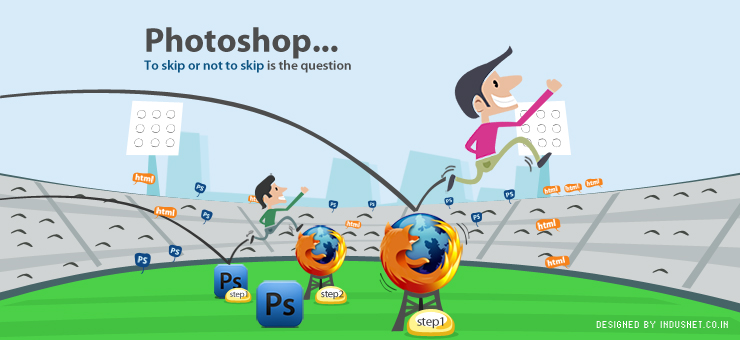
Web designers can be roughly classified into two groups: The first group chooses to translate ideas and sketches into Photoshop, and then design the website in HTML and CSS. The second group directly dives into HTML and CSS by skipping the option of working with Photoshop. There are arguments to support both the choices and it is difficult to conclude which could be a better way to design websites. In truth, each client must be considered individually and depending on the kind of project that the designer has to tackle, an appropriate method can be chosen. Why Skipping Photoshop May Be Necessary Web designers who choose to directly work with HTML and CSS after initial sketches do so successfully, and have several arguments to back their decision. Photoshop Is Static A Photoshop mock-up is static, and can’t easily be edited, updated and changed as and when it may be required. One would have to make changes to the original Photoshop file, and then upload the file through FTP servers in order to make the changes available real time. A website that has been designed entirely in HTML and CSS can be edited and changed very easily. In a content-rich world where one uses a lot of text, using HTML and CSS could be a better way to design websites than diving into the complex world that Photoshop presents us with. Working with typography is always easier on an HTML website. Photoshop Is Complex HTML and CSS based websites are minimalistic in nature and are best suited for those websites that are text-heavy and dynamic. Websites that use only HTML and CS allow more interactivity and team-work. It is easy for coders and web designers to maintain sites that make use of only HTML as codes can be written, rewritten or altered in a matter of seconds to minutes. HTML websites also allow for more accurate feedback instantly. Using Photoshop Always May Not Be Economical Content-driven websites rely heavily upon linking, and it is not possible to link Photoshop mock-ups as easily as HTML-based websites can be. Photoshop gives prominence to details and production of a website, and can be very important when designing feature-rich websites that incorporate layers, textures, colours and designs. However, much time and effort, and valuable money is spent unnecessarily when web designers choose to work with Photoshop and then use HTML and CSS. HTML and CSS Are Simple, Interactive and Easy to Edit Thus, by skipping Photoshop web designers can make sure that the websites are more interactive in nature and that they are text-friendly. Making changes to the layout, editing, and reformatting websites can be extremely easy when one chooses to work with HTML and CSS. HTML and CSS websites provide the simplicity that many clients have begun to love, and there is nothing wrong with websites that are not complex to handle. Sometimes, Photoshop Can’t Be Skipped At the same time, one cannot dismiss Photoshop. It offers the most complex and most detailed tools to design static pages, and layouts which are simply not possible with HTML and CSS. The minimalism and simplicity that HTML and CSS offer may not be well-suited for websites that require rich-graphics, colors and images. Thus, Photoshop-based websites are better suited when clients specifically require feature-rich websites that are eye-candy. Using Photoshop is very important while designing websites for fashion, luxury, entertainment and art. Though web designers stand to save time and effort when they choose to use only HTML and CSS, but such websites are best suited for clients who need webpage that are text-driven, and seek minimalist and simplistic layouts. Skipping or Not Skipping Photoshop Depends on the Context At the end of the day, skipping Photoshop or relying heavily upon it are not mutually exclusive. Regardless of what web designers prefer using, it is important to be at ease with designing websites that do not need Photoshop, and also that which need this wonderful tool. It is as simple as assuming that certain kinds of websites do better with Photoshop and certain kinds of websites just do not need it. Depending on the context, content, target audience and maintenance goals of a website, the choice of skipping or not skipping Photoshop must be made. This article has been contributed by the Indus Net Technologies Web Design team, based on experience of few team members, while they produced websites for our numerous clients.

Read More »

Who is the hero?

Creating a website, from planning to delivery, is like making a movie. And like movie, designer is the director here. Designer is the person who knows out and out about the website’s target audience, budget/timeline for creation, what to sell, what are the weak and strong points of the product / service that are going to be sold etc. Same with movie making, director is the person who is the captain of the ship. He is the best person who has the big picture in mind. No one else has that. Now as the director is decided, who is the hero of a website? Answer is: the product or service that will be sold through the website. We often forget it and give much more importance to other elements / sections of the website like layout, colors, background, text content etc. These are all important but with context to the the product / service to be sold. When creating a website keep this in mind. Keep the hero at the center of attraction and let other stuffs revolve around it. Imagine a James Bond movie (which is hero centric) is coming up and you know about many things like the starcasts, basic storyline, locations etc, but who is playing Bond. How interested will you be? So Bond (the hero) needs to be promoted in right manner first and then comes the rest. Same with websites, product / service first, everything else should simply follow that!

Read More »
MENU
CONTACT US

Let’s connect!

Loading form…

CONTACT US

Let’s connect!

    Privacy Policy.

    Almost there!

    Download the report

      Privacy Policy.