Category: Web design

Punk Revival in Graphic Design

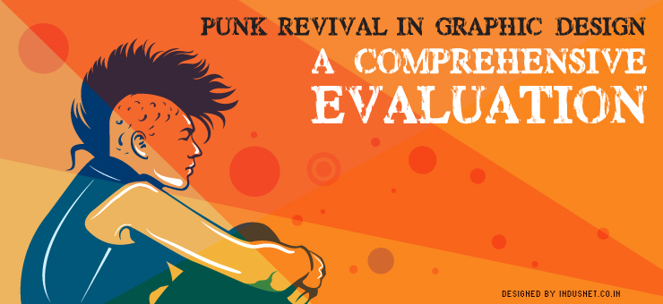
Punk Revival in Graphic Design: A Comprehensive Evaluation

When the punk movement happened in the 1970s, people mistook it to be just another youth movement that was trying to rebel against existing norms. Others confused it with a working class subculture that promoted violence and radical thinking. People were of course mistaken. The history of punk movement The punk movement was a reaction to existing artistic sensibilities, which included an elitist attitude among the design and art community. Punk identified with the common and the working class & tried to rebel against the oppressive elitism of upper classes. Artistically, it was postmodernism in disguise. Just like postmodernism, punk was a reaction against modernism, staidness and propriety. While punk music was just one aspect of the punk movement, a larger part of the punk movement consisted of graphic designing. Typography, in particular, came to be influenced by punk ideas. For instance, the DIY nature of many bands’ album covers, including that of the Sex Pistols, was an initial reflection of what the punk movement was doing to graphic design. Today, punk revival is happening in a slow yet steady manner. Most graphic designers agree that a lot of emphasis is given to ‘corporate’ typography, being perfect, being trustworthy and other platitudes. What the punk revival is going to do to graphic design is something that most people do not understand. In this article, let us try and see how you yourself can be a part of the punk revival movement in graphic design. Kitsch Kitsch was deliberately and professionally produced bad art. This provided a sense of satire and cynical pleasure by taking a stand against professional art. Likewise, you might want to create ‘kitsch’ yourself, when you try to create graphics. Of course, this has to be discussed with your client and if the client is a creative-type, they will probably want to experiment with kitsch. Kitsch, for the sake of art, is good but actual kitsch isn’t. Retro design In the perfectionist world that we live today, graphic design techniques that were in vogue a few years ago go out of fashion within no time. Why not challenge the norms by reviving retro Internet fonts and designs? Create graphic works that reflect the initial days of the Internet; probably from the 1990s. It brings back a sense of nostalgia while trying to rebel existing norms. It might sound funny but retro can be very rebellious. Not everyone expects to see something from the 1990s, especially, when we are moving and hurtling towards future at a breakneck speed. Shocking design In today’s hyper-connected world, it is becoming increasingly difficult for graphic designers to shock their viewers. A little brainstorming and a loosening up of your own professional inhibitions might help you to create something shocking. Shock yourself before you try to shock someone else. However, shocking does not mean offending people. Do not ever try to offend anyone with your professional work. That just doesn’t work. Collage Combine various forms of graphics to create something unique. Take parts of designs from previous projects that were not sold and try to make a collage of your professional failures. The end result can actually be something very successful. Collages are very artistic and can convey meanings that we didn’t even intend to, in the beginning. Imbibing collage in graphic designing can have a very surprising result when the project is complete. It is never a bad idea to be experimental, if the client is willing to be experimental as well. If you are a graphic designer who is looking for various options to be different and trying to carve out a niche for yourself, you might want to read a lot about the history of punk movement. It is a very surprising movement with a lot of inspiration for those who are seriously into creating art, be it graphic design or music or painting. If your clients are the creative type and are looking for ways to be different themselves, have a word with them and enquire if they are willing to engage in some punk revival techniques. Chances are it might even help your client to become successful because of the attention your graphic design is going to give them.

Read More »

What Is the Future of Video Streaming in Web Design?

Most companies, by now, have realized the value of video streaming as an important medium. It is not only easier and more effective to reach a certain target audience but it is also a quicker way to communicate what you want to. All that a person needs to do is hire a company that makes great real or animation videos and then stream them on websites. These videos might bring you more results than publishing only blogs. Importance of video streaming on websites Many research studies have shown that when a blog post contains a video that can be streamed, it attracts more audience. This has been proven true in many countries including the U.S., Canada, Europe and Latin America. The only places where streaming isn’t seen as an attractive medium is where people prefer to download videos. This is true in countries like India and China, where people have access to pirated videos. What we need to understand is that when people are used to downloading videos for viewing later, they simply do not understand the advantages of watching something in real time, with the help of streaming services. With that in mind, there are several scenarios that play out in our minds. In 2014, we expect a number of changes to occur within the streaming industry. Here are a few basic changes that we expect shall take place. Current scenario for big name video streaming companies Big companies like Netflix, Google and Hulu will need to figure out new ways to make money and also improve user experience. Distributors have been extra cautious when it comes to streaming because companies like Netflix have almost reached a saturation point. It is also quite clear that they are not making as much money as they would like to. This has resulted in a situation where Netflix and others have begun to look for alternative sources of money, which includes advertisements. Currently, Netflix charges $8 per month for all-you-can-use subscriptions, which is really good for the consumers, but bad for the company. If Netflix and its competitors begin to use advertisements, web designers will also likely have to build websites in a different way to take into account certain codes that come along. The probability of 4K videos and how to conquer a brave new world Apart from understanding different ways of monetizing and bringing revenue to videos that are being streamed, companies and web designers must also need to focus on emerging technologies. One of them is the 4K streaming video, which is being discussed everywhere right now. While Smart TVs and 3DTVs have begun to make inroads, industry pundits have already begun to talk about 4K. 4K literally means 4,000 pixels. A 4K Ultra HD has about 3,840 pixels and 2,160 lines where as a 4K film has 4,096 and 2,160 pixels and lines. For streaming 4K on YouTube, one needs 4,096 x 3,072 or 12.6 megapixels with an aspect ratio of 4.3. Vimeo follows similar specifications and we are still not clear about Netflix, which is supposed to bring 4K later sometime in 2014 as well. One might wonder why we need so many pixels when human eyes can’t make out the difference. To be clear, the human eye can make out minute differences and a 4K video will certainly be better than what is being used right now. At last year’s CES, one could witness 4K screens and as many would agree, it is one of the best that people ever had witnessed. The brightness and image quality are impressive indeed. However, when it comes to streaming 4K videos online, one might need to be a little wary as they consume a lot of data. Right now, there are no screens that are compatible with this technology. Thus, there is a lot of time for web designers to figure out how best to stream videos of this magnitude. Apple’s Retina Display can withstand up to 2K and the MacBook Pro can take about 3K but there simply are no devices in the market that can handle 4K videos. Thus, web designers have enough time to learn how to stream 4K videos in the next few months, before screens that can take 4K videos become commonplace. Right now, one cannot even expect full HD streaming without interruptions. Thus, expecting 4K videos to be available on mobile websites on our smartphones is a very futuristic idea. Though futuristic, it is not unrealistic. We are certainly going to get there in sometime and that is one of the reasons why web designers have to start working on streaming these videos effectively right now. Building a contemporary streaming website In the second part of the article, we would like to take you through building a contemporary website that features video streaming. First of all, it is very important to create a user-friendly interface. Streaming video is not easy and is quite complex. For this reason alone, a designer will need to be well aware of resolution sizes, volume levels, display quality and a host of other things. One of the best examples of video streaming websites is Vimeo. The videos appear large and are built into an interface that is user-friendly and no non-sense. What you really need to bear in mind is that your website has to support Flash or HTML 5. Flash is not supported by iOS devices. For this reason alone, we recommend using HTML 5 as much as possible. A video streaming page should always have social share buttons so that the video can be shared across social networking websites. The side bar and other controls have to be easy as well and not too difficult to navigate or maneuver through. The website should be easy on the eyes without using a number of features or things that could, otherwise, distract the user. Most importantly, the website should load fast and must not take a lot of time to buffer. Your bandwidth needs to be high

Read More »

How to Convince Clients about the Importance of Responsive Web Design

We all know why and how responsive web design is important & why we must be asking our clients to go for a responsive design instead of sticking to legacy designs that have been around for a while. However, there are still a large number of clients who do not want to upgrade their existing websites or they do not understand the importance of mobile devices and fluidity of screens. While they might have genuine reasons to feel skeptical about changing their existing websites, you have a genuine reason to convince them; and that is not to bag yet another project to design responsive websites. In business, those who succeed in the long term tend to be altruistic in nature, helping their clients as much as they can. If altruism was somehow connected to web design projects, we strongly suggest web designers recommend and try to convince their clients to go for responsive web design. In this article, we shall discuss why you must convince a client to go for responsive web design and how you must go ahead about recommending a responsive web design. 5 Reasons why you must convince your client to go for responsive web design • Responsive Web Design is the present and will continue to be the future Let us face it. We have been toting our iPhones and iPads for a long time. No one really uses features anymore and it is true of most developed countries. This means, more and more people are accessing the Internet using smartphones, tablets & certain hybrid devices that are a cross between laptops and tablets. iOS and Android devices along with Windows devices have continued to hold a grip on people’s buying options & thus, most people tend to have varying screen sizes. There will never be standard screen sizes and people will continue to buy different devices according to their own needs. Responsive web design ensures that a website looks great, no matter how big or small the device’s screen size is. Certainly, responsive web design is future-proof. • Responsive web design can easily be updated Your client might not be ready for responsive web design but he also might not realize that old websites are slower, do not get indexed properly and suffer downtime often because of bad coding. When pages do not load fast enough, the websites suffer in the short and long term. When your client realizes this, he will want to get his site updated to something contemporary like responsive web page. Instead of letting them have old websites which eventually have to be updated after suffering losses, it is better to help the client understand the importance of responsive web design. • Responsive web design is not all about mobile devices People have a wrong idea that responsive web design is important only because people have begun to access the Internet using their mobile phones or tablets. Instead, responsive web design is important because a website looks great on any screen whether it is mobile or conventional. For this reason alone, it is important to help the client understand the importance of responsive web design. Whether a person uses a 21 inches iMac or a regular laptop of 14 inches, whatever the pixel size maybe, a website shall look great, if responsive design techniques are employed. • Responsive web design is social-ready Most responsive web design techniques ensure that content is shared easily on social media websites. Social media is extremely crucial in driving new prospects to your clients. If you wish for your clients’ success, you will need to help them understand the importance of social media and sharing content on social media. For this reason alone, one will need to go ahead and ask them to get responsive web design. It does not take a lot of effort to build a responsive website but when a website is not responsive, it will cause a lot of business damage to your clients. • Responsive web design solves problems It is very easy to see why people have begun to adopt responsive web design. It solves a number of technical, interface related and financial problems for both users and clients. Responsive web design is future-proof and is thus, technically sound. It ensures that no matter what sort of devices come into the market in near future, the website will be ready to be displayed in the best possible manner. On the other hand, not using responsive web design techniques can cause a lot of problems. This includes not being able to view websites easily on all platforms, not being able to load the pages fast, not being able to share pages on social media and a host of other problems. All these problems should convince you, as a web designer that your client needs the best that you can offer, which is to design a responsive website. Now that you have understood why it is important to convince your client about responsive web design, let us take a look at how best you can do it, without sounding like someone who is desperately selling something that comes with frills. The problem with selling and convincing people about better technology is that we risk sounding like desperate salesmen. On the flipside, being the people who will forge ahead with newer technologies, we have a duty to ensure that Internet and its users have access to the best websites that will be designed in the near and long term. 5 ways to convince clients about responsive web design • ‘View full site’ is an old-fashioned way to build websites When you need to present your case to your client, tell them that ‘View full site’ was something that we used to do many years ago. It is no longer used and is an old-fashioned way to build websites. Responsive websites automatically realize what the screen size is and present content in a way that is best viewed on that screen size. Your

Read More »

Is Culture-themed Web Design for You? A Contextual Analysis

As more and more businesses begin to warm up to the idea of designing country-specific websites, cultural context becomes important too. Though most medium and large companies have begun to open offices across the world, they still tend to have a single website or if they build a location-specific website, it tends to be sans cultural content. Placing a website in the context of a country’s culture can make it look more appealing, charming and even welcoming. In this article, let us take a look at different geographical regions that need culture-specific websites. We shall also run through the major language that can work well even if that is not the official language of a particular country. North America When it comes to building websites for a North American audience, you could probably take as much freedom as you want. It is a matured audience that is well versed with the latest in web technologies. You do not probably have to worry much about placing your website in a cultural context unless you are specifically selling something that is cultural. For instance, if you are a restaurant specializing in Middle Eastern cuisine, you could probably design a website that reflects Middle Eastern aesthetics. Apart from examples like that, in Canada and the U.S., you do not really have to worry much about ‘culture’ when it comes to designing. A French or Spanish version of your website might do well, if your audience is mostly located in Quebec, in Canada or in Hispanic-dominated areas of the U.S. like Florida. While Mexico is part of North America, we shall consider it to be part of ‘Latin America’, a term that includes Mexico, Central America and South America. Latin America When it comes to Latin America, you could be sure of one thing. Most countries are Catholic, speak Spanish and have a very colorful culture. Building a website that reflects the geographical diversities of this region will work well; so shall a website that features Latin American culture, even if it means going country-specific. Exceptions are Brazil and the Caribbean islands. In Brazil, the official language is Portuguese and a Brazilian-focused website should feature Portuguese content & not Spanish. We cannot stress this enough to our clients who have often communicated to Brazilians in Spanish with often disastrous consequence. Likewise, many Caribbean islands like Jamaica, Trinidad and others speak English, albeit a different version. Your regular North American website could do well in these countries. Latin Americans value family values and Catholic ethos. To be aware of these sentiments can help you avoid making cultural blunders. Europe Europe has to be the most diverse and complex of all the geographical regions. Each country in Europe tends to speak a different language; and each country has rather startling cultural differences, which make it mandatory for you to engage in heavy groundwork before building a culture-specific website. It is not enough to build a website in French, English and Spanish. You probably will have to consider Russian, Serbian, Italian, Romanian and a host of other European languages as well. This makes building websites for European audience a very complex yet exciting task. Africa Africa is as diverse as a continent can get. However, it is not as difficult to build a website for African countries as it is for Europe. The major languages that are spoken in Africa include English, French, Arabic, Portuguese, Spanish and Swahili. English and French can take you a long way & if you build a website in Arabic as well, it will help you further as most North African countries have Arabic as one of their official languages. We recommend building websites in French and English, where the possibility exists. Countries like Angola, Mozambique, Sao Tome and others can be addressed with Portuguese. A majority of African countries either have Islam or Christianity as their official language. These socially conservative countries might not be open to content that are radical. When it comes to shocking your audience here, take it easy. Middle East Obviously, the most conservative of all audience, Middle Eastern countries tend to speak Arabic. Building a website in Arabic and English should take care of all your Middle Eastern audience except Israel & Iran, where Hebrew and Persian are spoken. Corporate websites tend to be conservative and thus, one might not have to worry too much about getting into trouble in these socially conservative countries. However, if you offer content that is considered ‘offensive’ in these countries, you might have to change your approach a little bit. South Asia Much of South Asia was colonized by the British. This means, most people who have access to the Internet can understand English. Building websites in English and featuring local models or content will help you attract your target audience. This is true of India, Sri Lanka, Bangladesh, Pakistan and even Maldives. These countries are socially conservative just like many North African and Middle Eastern countries. You will not hurt your business as long as you understand that people in socially conservative countries tend to get offended easily sometimes for the wrong reasons. As long as you publish content that does not stray too far from your business and remains family-friendly, you are sure to find success. South East Asia Countries like Thailand, Singapore and Malaysia are affluent & have a well developed business culture. You can take a few risks with content as long as you do not offend people in countries like Malaysia and Indonesia, which have Islamic laws. However, Thailand is one of the most liberal countries in the region and often attracts a lot of tourists. Thus, you can get away being yourself in a place like Thailand than in Indonesia. Other countries in the region which share similar cultures are Vietnam, Laos and Cambodia, which are all similar to Thailand & are quite liberal. The Philippines is a catholic country that has a culture similar to those in Latin America. Spanish is easily understood as

Read More »

Why You Must Engage in Avant-garde Web Design Techniques

A number of people often wonder if websites need to be designed in a cookie-cutter manner, without much room for creativity. The answer is clearly ‘no’. However, a lot fop people still continue to develop and create websites that are ordinary, boring and even plain redundant. When websites lack creativity and when there isn’t a lot of novelty in a website’s approach, it becomes very boring. If the website is intended to provide creative, artistic or stylistic value, it better be ‘avant-garde’. The term avant-garde is usually used in the field of art and design & thus, should not be too far from web designing. Web designing is all about creativity, design and to a large extent, art. When people realize this basic structure of web design as a subject, they will begin to see it more as an art than science. In this article, let us take a look at how website can be avant-garde and why it is important. Before that, we need to understand the history of the avant-garde movement and the way it has continued to influence in a number of areas. History of avant-garde movement “Avant-garde” is a French word that literally means front guard. It is usually used to denote a sense of experimental, novel or alternative, especially, in terms of art and culture. The avant-garde movement tries to push the boundaries of what is the norm. The movement officially took place at the Salon des Refuses de Paris on May 17, 1867. Avant-garde is thought to be elitist but it really isn’t. It might promote radical social reforms and comes with a manifesto of its own. It has often been described as art of the sake of art. In web design, we can say that avant-garde websites are those that are designed for the sake of websites themselves! Here are some tips and tricks to be avant-garde when you build websites: Push the boundaries of web design theory When designing websites, do not succumb to the traditions and conventions. Instead, try to push the boundary and try to shock your own sensibilities. You might not want to take this as the final website but it can always become a way to stimulate creativity. Pushing the boundaries of design ideas also helps you to be more creative and different from others. Chances are, your client will appreciate you for your creativity and for being avant-garde as well. Do not be an elitist While being avant-garde is cool, it is not the same as being an elitist. Do not attempt to create websites that confuse visitors and leave them feeling that they have encountered a website that is ‘beyond them’. Instead, try to think from the perspective of the visitor and how you can give them a novel experience of using a website. Promote web design reforms Do not succumb to written codes and rules of web design theory. Instead, breathe a fresh breath of life in to the profession of web design by creating something new. Promote reforms within the profession and always try to look for ways that can help web designing profession to change. Do not follow but try to change the norms and lead other web designers into following you. Create websites for the sake of websites Avant-garde has often been described as art for the sake of art. Likewise, create websites not to please your customer but for the sake of web designing profession. Make it your passion and create websites that will be used as models by others. Ensure that you are not succumbing to norms and styles that others have perpetuated. Think out of the box and try to lead others. Avant-garde has often been described as the last refuge of the intellectual. Likewise, if you would like to create websites that will be respected for a long time, read up the theory of avant-garde and try to lead the way instead of following. Most importantly, do not try to be an elitist or create websites that make you look pretentious. That is not the idea of being avant-garde. Instead, try to be creative, think in novel ways and create something that will be appreciated by your peers and clients.

Read More »

Why Sleep Is Important for Building Great Websites

Building websites is not only a science but also an art. It requires professional technical training and a lot of design instruction weaved into the curriculum. Inherently, a person should have the aptitude to build websites and a sense of colors in order to choose the right combination. A web designer must also be aware of a changing world and an ever changing Internet. While a web designer needs to be good at all these and more, he or she might forget that sleeping adequately is more important when we look at the long term effects. Web designers work by the computer for long hours and require a lot of rest. However, most web designers do not sleep enough as they have to meet deadlines, suffer from eye strain which causes sleep disorders and tend to work at night, thus disturbing the circadian rhythm. A minimum of 7-8 hours of sleep is required in order to remain healthy, creative and happy. In this article, let us take a look at what happens when a person has not been sleeping well for a long time and how lack of sleep affects the quality of websites that are designed. Lack of sleep reduces creativity A person is creative only when he or she has slept well. A good night’s sleep ensures that people wake up fresh, rejuvenated and with a clear mind. When a person is exhausted, he or she just cannot be creative. That means websites are not designed well. Sleeping enough and taking long periods of rest helps people to wake up refreshed and they will be in a better position to work efficiently and creatively. Lack of sleep causes health problems Not sleeping enough reduces one’s immunity and can cause metabolic disorders as well. In the long term, a person might develop cardiovascular issues leading to expensive procedures and sometime life threatening situations. When a person’s health is not in the optimum condition, he or she might take frequent leaves from work and miss important deadlines. If you are not healthy enough, you probably will not meet those deadlines anyway. Lack of sleep induces irritability When a person has not slept well, they tend to be irritable and get easily annoyed. This result in interpersonal problems at work and a person who has not slept well will not appear pleasant and happy to clients either. Lack of sleep can lead to animosity indirectly and thus, work might get affected. Web designers work in teams and when there is no healthy relationship with people that we work with, our work tends to suffer as well. Irritability is one of the main reasons why conflicts occur at workplace. Lack of sleep causes depression Depression is one of the most common (after common cold) and the most serious of all ailments. Depression can be triggered when a person does not get good sleep over a long and continued period of time. This means people will not be able to attend to important things and might instead spend time in negative cognitions. People who are depressed might require serious psychological and psychiatric help and a lengthy period away from work. Sleeping well and getting enough rest can prevent depression. Lack of sleep kills motivation Any creative task requires one to be motivated. Motivation is very important for getting work done. If one lacks motivation, creativity fails too and so shall the quality of work. If a web designer should feel motivated enough to work, he or she should sleep well. Not sleeping well can cause serious motivational issues to people and their work will suffer. Sleep has been known to be one of the most important factors in keeping people active, cheerful and motivated. Though most web and Internet professionals do not realize, sleeping well is crucial to their professional development. There is nothing more important than getting enough rest and staying healthy. At the end of the day, our health is even more important than our own professions; and if staying healthy is important to remaining active in our professions, we have a professional duty to be healthy; and that implies, we have a professional duty to get that well-needed sleep at night.

Read More »

What Is Parallax Web Design?

If you have played video games, you would have heard the parallax effect. It is a 2-dimensional effect that is caused by using different background images and movement speeds in order to create a sort of illusion that enhances depth perception. This illusion is experienced during game play. By making the background of the video game proceed slower so that the foreground seems further away. Even in a parallax website, the same concept holds good. The background images of a website move at different speeds so that the rest of the page appears as if they have a depth perception. This visual effect can be used to create a number of creative formations to enhance online storytelling. The sense of depth perception is an illusion and is not actually caused. This helps web designers to create different websites for different audiences, sometimes with same layout, format and design. It is indeed a great way to enhance an existing website and appeal to the younger crowds, especially children and adolescents. Adults may not be very impressed with this technique and must be carefully used thus. Here are some of the applications of parallax design: • Page depth and animation Without using 3-dimensional techniques, one can create the illusion of depth using parallax design. It is a great way to promote certain products that are specifically targeted at youngsters. It helps them to draw parallels between your product and the video games they may often play. It is sometimes considered one of the easiest ways to design children’s websites. • Enhance storytelling Parallax website design enhances storytelling. This ensures that a product’s conceptualization and its manufacturing can be explained, if need be, in the form of a story. It can also be used to animate certain aspects of your company’s story telling which otherwise cannot be explained properly with the help of pure text. • Increase the duration of page visits When people scroll along parallax websites, they will end up spending a longer time on the websites. This enhances page visit durations and ultimately, your ROI. In order to experience the parallax effect, they will have to scroll down the entire length of the page, which also enhances page visit duration. • Enhance call to action Parallax website design is a great way to enhance call to action pages. As there is already a visual element that is ‘sticky’, people will spend more time on the websites and eventually click on the call to action button as well. • Increase interaction Parallax is an inexpensive and effective method to increase interactive viewing. While there are several methods to increase interaction, parallax can be often easier than the others and be time and cost effective. All that being said, there are several disadvantages of parallax website design. Some of them are: • Bad SEO Search engine optimization takes a hit when we use parallax design. Parallax websites are not SEO-friendly and do not appear in the search results as often as plain websites. It will have only one set of meta information, one URL and one h1 tag. This leads to an ineffective usage of existing SEO features • Pages load slowly The idea of parallax website design is to juxtapose several images in the background. While this method can create a great visual illusion, it can increase the time of loading of a page. This may unnecessarily annoy busy visitors who will leave without waiting for it to load completely. • Older users may get annoyed Parallax website design is great for websites that are meant for children. Older users may find the technique annoying and may not take your website seriously. Whle it is great for products that are aimed at youngsters, you may not want to create a corporate website with parallax website. One must always use web design techniques appropriately and ensure that they are targeted for the right target audience. What is good for children will not be good for adults, and what is good for adults may bore children a lot. Thus, you will need to do some groundwork before deciding on unconventional visual effects which can increase page loading time, cause unnecessary distraction and cause SEO-related problems. However, if you know what you are doing and are aware of its downsides, parallax web design can be a great way to enhance popularity among youngsters.

Read More »

Importance of fast and good landing pages

Speed: with the increase in the internet speed “want it now” attitude is increasing, you have less than 2 seconds to present and give an awesome experience to your potential customer or you would lose one potential customer forever, yes that is very much true in this competitive world. These are a list of some basic landing page success factors: • Trust Elements: Trust elements like TRUSTe, Verified by visa, verisign and other elements that help the visitors to see your site as trustworthy entity to do business with. These elements some good recommendations by authoritative and famous people from the industry. • Highlight some USP’s of your website : List your usp on your landing pages that will increase the probability of the targeted customer going down to the conversion funnel very easily. • Credibility: Credibility the most important part for any business, this will increase the call to action (CTA) of your potential clients at least by 10 times. • Use wooing headings and graphics: The graphics must be consistent with the campaigns and generate empathy to the audience. Don’t underestimate the importance of creative and colorful graphics in your website. Keep posting trivia on your website which will make your customer re visit your website time and again. • List of Criteria to increase CTA: * It should explain the following things? * What you deliver? * What value can customers expect to receive from you? * Technical product descriptions offered • Options to stay in touch * Contact details * e-mail address * Facebook , Twitter page address • The most important feature is CTA buttons in your website enabling the visitor Some more tips * Grab the attention in the first 30 seconds * Ask for minimum information * Run a/b testing “People will forget what you said, will forget what you did, but will never forget how you made them feel.”

Read More »

11 ways to reduce unnecessary load on your WordPress site

Unnecessary load on your website is like uninvited guests at your home, some of them are good but most of them will make your life difficult instead of helping you anyway. They will keep you busy and for that you may miss your real guests. There are thousands of bots crawling in the web daily but not all of them are made for you nor are they of any help to you. In order to solve the unnecessary crawling/load on the server it is recommended to follow the next optimization steps for your sites. 1. Pay attention to the scripts provided in this post. Special attention should be paid to scripts that use MySQL. Maybe changes to some part of code are needed. For example: – Disconnect Post Revisions in file wp-config.php define (‘WP_POST_REVISIONS’, false); -Reduce the number of request. Eliminate unnecessary requests to expedite the     generation of the page. For example, the following typical code can be removed if found in all the themes. for WordPress: <meta http-equiv=“Content-Type” content=”<?php bloginfo(‘html_type’); ?>; charset=<?php bloginfo(‘charset’); ?>” /> Replace to: <meta http-equiv=“Content-Type” content=“text/html; charset=UTF-8” /> 2. Update CMS to the last version available (http://wordpress.org/download/) 3. Update all used plugins for WordPress CMS, and delete unused. 4. Install next WordPress plugins: – Optimize Db. Can be downl oaded at http://wordpress.org/extend/plugins/optimize-db/ – WP-super-cache plugin or any other plugin that enables caching for this CMS (link to wp-super-cache -http://wordpress.org/extend/plugins/wp-super-cache/) or WP3 Total Cache, it can be downloaded from http://wordpress.org/extend/plugins/w3-total-cache/ – Avoid plugins that cause high CPU load such as: *All in One SEO *Broken Link Checker *Yet Another Related Posts Plugin *NextGen Gallery 5. Disable wp-cron by editing your wp-config.php file and eding line: define(‘DISABLE_WP_CRON’, true); Create the following cron task in your control panel: 0 */2 * * * wget -q -O – http://yourwebsite.com/wp-cron.php?doing_wp_cron >/dev/null 2>&1 6. Don’t use ETags unless customer are taking advantage of it. How to http://www.tipsandtricks-hq.com/how-to-add-far-future-expires-headers-to-your-wordpress-site-1533#removeEtags 7. Use external scripts. Instead of placing tons of code in your header.php file, use external scripts. This allows the browser to cache the script so it won’t have to read it for every other page 8. Keep page sizes less than 100 Kb. Do not use too many unnecessary images and video on a page. Always compress the images appropriately. 9. limiting unneeded hits through a robots.txt As for robots.txt file please refer to the following link to know correct syntax for it: http://www.robotstxt.org/ 10. for the wp-login.php; it might simply means that your wordpress dashboard is open for brute force. You can resolve it by limiting access to your wp-admin folder to specific IPs in case no one else is supposed to gain access other than the administrator. (http://www.netmagazine.com/tutorials/protect-your-wordpress-site-htaccess) 11. There is a WordPress plugin called “Login Lockdown, http://wordpress.org/extend/plugins/login-lockdown/ which will block any IP that guesses an incorrect password a certain number of times. This post is written specially for those sites using WordPress CMS. However some of the points are also applicable to other sites. We welcome some comments in this thread, please feel free to comment and share your ideas to make the webmaster’s life easier to fight the spam’s and save bandwidth.

Read More »

How to Survive Future: Adopt Gesture Driven Interface

In a constantly changing world of technology, adaptability is the key to survive. A trend that picks up among the tech-savvy crowd is received with much fanfare if introduced in the gadgets. But this trend is not necessarily here to stay and once the euphoria dies down, a not so promising trend gathers steam. This potential of the trend that picks up is not fleeting in some cases as in gesture recognition technology. It you take a closer look at the young generation of this age, it does not take much time to comprehend what this technology has in store. This section of people such as the recently weaned five-year-olds can outwit the grown-ups and explain the functional and operational aspects to them without even blinking. Such attachment to this technology is much more than a product designer bargained for. Apple redefined gesture and touch interfaces The introduction of Apple’s iPhone sparked the trend of brands banking upon gesture-driven interfaces and this euphoria attached to this iconic device among people is not showing any signs of dying down. It should be brought to notice that touch and gesture devices were experimented by many brands with little or no response from tech-savvy people. All the nonchalance related to it seemed to make it clear that this technology was never to be received by gadget-lovers with open arms- iPhone changed it all and gesture technology received the much needed impetus and people have been privy to the allure since then. The app reviews from the Apple App Review Board too have revolutionized the use of gesture recognition technology. It has helped filter a truck load of unnecessary and below-par apps that do not meet the specified standards. This sifting from Apple has raised the bar truly, but has made other brands to become a part of the competition and helped them not concede their business to other technology giants that have raked huge profits using parallel technologies. How to design a good gesture-driven interface? Here are a few tips to design a good gesture-driven interface: 1. Get rid of top and bottom bars This part of the functionality now in place in many gesture interface gadgets was experimented and used by Apple long before its popularity. These top and bottom bars can be held accountable for the clutter on the screen as they nearly occupy 20% of it. Given the tiny size of the gadgets such as smart phones, every pixel of them has to be judiciously used and occupied. This gives more room for the content. 2. Progressive disclosure is important Instead of the screen being clouded with a lot of notes that pop up, it is better to use visual cues along the way. A deluge of information at the entry point of the app can leave the user confused as to how he can use the app. This should be avoided and the user has to be provided with this bit of information as and when he uses the app with a good amount of creativity and skill. Intrusion too is a big problem in this case. 3. Other tips Tapping and double-tapping should also be used judiciously as when the situation demands it. There can be no reservations on this too. Another way of assisting the user in performing certain operations of their choice is to display the user full screen, the hint and later it can be designed to fade away after a few minutes when the user has been notified of the operation. There are more options such as the choice with the highest priority in the menu being highlighted so that it does not escape the eyes of the user. All of these other tips also can be fairly used to convey the much needed piece of information. A good recce of user habits can be very much helpful. Case Study Mr. Y suffered much in his career because of not switching to gesture recognition technology in his work. Though he had a difficult childhood, he persisted with hardwork and achieved a good education. He settled for a suitable job in a company of his choice and was drawing a handsome salary. As he was known to never get bogged down by expectations and hardships, he reached the zenith of the concerned industry and managed huge projects. His charisma inspired many people to strive for the impossible. Later, as he was doing well in his profession, he thought of earning through his profession by freelancing. He built a good rapport with a good number of clients and soon his career was up and running. After a considerable number of years, he got accustomed to conventional way of designing websites and never thought of adapting to the changing environment around. He did not take the emergence of gesture-driven interface in gadgets seriously because he thought the fanfare for these gadgets was a farce. Soon, he could not keep up with the changing atmosphere after this technology came into being. To add to his woes, he was a person who was not keeping with this generation and this caused his downfall. Lessons that can be drawn from this story You should strive very hard not to end up like the gentleman in this story. If you are to say that gesture-driven interface and other ultra modern technologies are not your cup of tea, it’s about time to think otherwise. Reconsidering the options may help your business or job get a boost and reach the zenith that no one expected it to traverse to. This being said, let us look into what changed the scenario completely and made brands explore gesture-driven interface as an option to consider. • People are used to gestures: It is no more a secret that people are now used to touchscreen devices and they are comfortable scrolling up and down using their fingers. They also know that a flip to the right changes the page or that it may delete something. Thus,

Read More »
MENU
CONTACT US

Let’s connect!

Loading form…

CONTACT US

Let’s connect!

    Privacy Policy.

    Almost there!

    Download the report

      Privacy Policy.