Category: Web design

Best Practices for Creating an Effective Web Form

Almost all websites need some kind of form to be filled, either for membership or registration. Sometimes, these forms may be required for voting or choosing certain functionality as well. While it is easy to create forms using HTML, visually attractive forms are not very easy to create. What Are The Must Have Features Of A Web Form? It is very important to make sure that web forms are visually attractive, and that they finish the form completion process as quickly and as efficiently as possible. There are several reasons why a web form has to be at its best. People’s attention span is very short. When they realize that they need to fill in a form to access what they want to, there are chances that they actually give up their goal and close the page altogether. The idea is to understand that people do not like filling forms, and thus it has to be as short, concise and simple as possible. People’s visual attention is centred on a vertical line and they always need to know how the job could be completed in less time. Thus, web forms should be lined up in an aesthetic manner. The submit button must be attention grabbing but be simple as well. No one likes to see endless and lengthy forms that don’t get over until one scrolls down for a long time. To make the form filling process easier, one should really know what information is being collected, and how the information collecting process can be simplified. One must also try and allow auto-filling of forms so that people can use their custom auto-filling software in order to fill as many details as possible. Arrow marks tell the visitor which direction he needs to click further to reach submission button, and progress indicators reveal how best to communicate the position, scope and status. Web Form Validation: Why It Is Necessary Of course, people do fill forms when they really need to move ahead. However, they may also enter wrong details and information. This is one of the reasons why web designers must consider web form validation. The idea behind web form validation is to make sure that users provided the right and properly formatted information in order to proceed further. It also makes sure if a user provided all the necessary information without missing anything deliberately or otherwise. Inputs that users make can be validated in two different manners. One is to validate it on the client’s (web browser) side, and another is to validate it right on the server side. When validation takes place on the server-side, information that is sent to the server is validated with the help of a server-side language. If it fails, the error feedback is displayed on the client’s screen. It is a secure method which works even if JavaScript is turned off. However, it takes a longer time to load and refresh. While server side validation is good enough for secure form validation, for a better and richer user experience, one might want to use client-side validation. However it relies on JavaScript, which is not always a preferable method. However, by combining both server-side and client-side validation, one could get a faster response, secure validation and amazing user experience. Ten Best Practices To Keep In Mind While Designing Forms Can Be Listed Below: Must be visually attractive and simple. Must be as short, concise and crisp as possible. Formats must be defined prior to creation of forms and it is always not a good idea to be very strict with them. Sometimes, users may not want to care about upper case or lower case as much as a web designer would. Passwords must always be confirmed, and once a form is filled it is a good idea to allow the user to confirm if the information is correct or not. Once information is validated, feedback should be given in a supportive manner. It is always a good idea to let validation take place upon submission of information in the form. Lesser the time, better is the user experience. If possible, using real-time validation is a much better option. If possible, OAuth options could be used as well, wherein clients can use Facebook or Twitter to fill in forms, if they are logged in. Combining server side and client side validations. Using HTML5 instead of flash-heavy pages. Some Of The Factors That Must Be Avoided Are: Single error pages are not pleasant. Once a form is filled and submitted, users would have to press the back button if they want to fix errors. JavaScript popups can be avoided. Lengthy and redundant forms have to be done away with. Textual forms look cluttered. It is better to have forms that are graphically rich instead. Avoiding help information in order to make a page look cluttered is not a good practice either.
Read More »

Cool Deals for Designers

Being a designer has its share of incentives too. Many web hosting companies, software resellers and internet companies offer discounts, deals and even cool freebies to discerning web designers. There are several deals at the moment for people who are interested in web designing and related activities. CSS-Tricks CSS-Tricks has a number of deals for designers. They have listed quite a lot of deals that could catch anybody’s attention, and some of them are a steal: 20% off on  CSSIgniter, UpThemes, Themify, ThemesKingdom and ThemeShift AND, 30% on WPCrown AND 25% on VivaThemes – all sites that sells WordPress themes. All in all, you should not buy a WordPress theme (or theme site membership) without checking out this deal page! 50% off on Ultimate Designer toolkit. The toolkit comes with patterns, brushes, gradients, vector illustrations, textures and photos. If you need some interesting icons for your web or mobile application, you might like to get it from WebIconSet, which is offering 20% discount. Last, but not the least, you can also get the stock photos at a 15% discount from DepositPhotos Remember: To get these deals, you must go to http://css-tricks.com/deals/ and then follow the link. You may not get any discount, if you go directly. Mighty Deals On MightyDeals.com, you could sign up and receive a number of deals right in your email. At the moment, they offer a 50% discount on Aurora 3D Animation Maker. At just $35, this cool tool is a great help when it comes to designing feature and graphics rich websites for clients. The tool comes with more than 3000 symbols and one could import SVG files. With 60 plus professional project templates and more than 80 object styles, no web designer would ever feel lost when he or she is trying to design professional websites. In fact, it is pretty simple to create animated videos, Flash SWF, animated GIF or just as a sequence of images. All that you would need to do is download and install Aurora 3D Animation Maker. It hardly takes a few minutes. The software comes with special features such as capability to emulate smoke, fireworks and even emptiness of space! The software requires Mac OS 10.6 or later or Windows XP/Vista/7. Inspired Mag Deals InspiredMag is yet another place where you can land up in many deals! Some of the cooler deals that we thought were superb include the 300 PICAS vector Icons, which cost $50, but with a heavy discount, one could get it for just $15. These are royalty free vector icons that are specially designed for web, mobile and GUI interfaces. If you thought market research was a tough job, you could go ahead and buy AYTM’s new tool for market research. It comes with tools to write surveys and mail them to your target audience. Responses are delivered within a few hours and you would even get clear description of your data. At $89, it is a real steal. Designer Daily Deals Similarly, Designer Daily has deals that are offered everyday for web designers. Design Delight Offers DesignDelight offers discounts and deals too and one of the interesting deal is that of PSD to HTML conversion tool, which costs only $68 after discount. It is pretty clear that these days most people prefer HTML based websites, than heavy PSD files. This tool could prove to be a lifesaver. Conclusion With deals becoming increasingly popular, and with the high prevalence of social media to market these deals, it is now well accepted in the web design community as well. Also, since most of the products required by designers are info-products, i.e. things that can be replicated without extra cost, discounts can be steep. Hence, this segment is going to stay – even if the popular deal sites offering discounts on food, health and travel struggles! So, keep hunting – and may be share some of the current deals with readers of this blog.  

Read More »

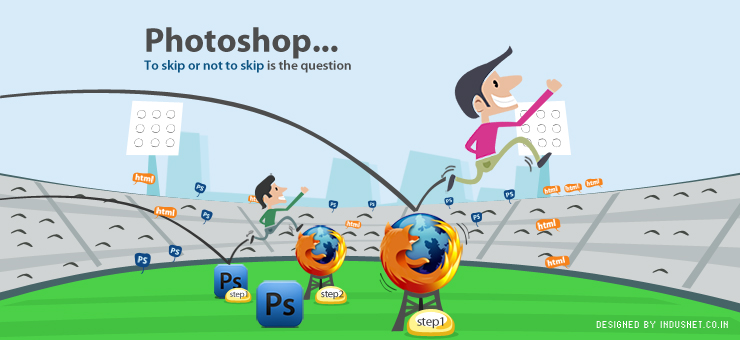
Photoshop: To Skip or Not to Skip?

Web designers can be roughly classified into two groups: The first group chooses to translate ideas and sketches into Photoshop, and then design the website in HTML and CSS. The second group directly dives into HTML and CSS by skipping the option of working with Photoshop. There are arguments to support both the choices and it is difficult to conclude which could be a better way to design websites. In truth, each client must be considered individually and depending on the kind of project that the designer has to tackle, an appropriate method can be chosen. Why Skipping Photoshop May Be Necessary Web designers who choose to directly work with HTML and CSS after initial sketches do so successfully, and have several arguments to back their decision. Photoshop Is Static A Photoshop mock-up is static, and can’t easily be edited, updated and changed as and when it may be required. One would have to make changes to the original Photoshop file, and then upload the file through FTP servers in order to make the changes available real time. A website that has been designed entirely in HTML and CSS can be edited and changed very easily. In a content-rich world where one uses a lot of text, using HTML and CSS could be a better way to design websites than diving into the complex world that Photoshop presents us with. Working with typography is always easier on an HTML website. Photoshop Is Complex HTML and CSS based websites are minimalistic in nature and are best suited for those websites that are text-heavy and dynamic. Websites that use only HTML and CS allow more interactivity and team-work. It is easy for coders and web designers to maintain sites that make use of only HTML as codes can be written, rewritten or altered in a matter of seconds to minutes. HTML websites also allow for more accurate feedback instantly. Using Photoshop Always May Not Be Economical Content-driven websites rely heavily upon linking, and it is not possible to link Photoshop mock-ups as easily as HTML-based websites can be. Photoshop gives prominence to details and production of a website, and can be very important when designing feature-rich websites that incorporate layers, textures, colours and designs. However, much time and effort, and valuable money is spent unnecessarily when web designers choose to work with Photoshop and then use HTML and CSS. HTML and CSS Are Simple, Interactive and Easy to Edit Thus, by skipping Photoshop web designers can make sure that the websites are more interactive in nature and that they are text-friendly. Making changes to the layout, editing, and reformatting websites can be extremely easy when one chooses to work with HTML and CSS. HTML and CSS websites provide the simplicity that many clients have begun to love, and there is nothing wrong with websites that are not complex to handle. Sometimes, Photoshop Can’t Be Skipped At the same time, one cannot dismiss Photoshop. It offers the most complex and most detailed tools to design static pages, and layouts which are simply not possible with HTML and CSS. The minimalism and simplicity that HTML and CSS offer may not be well-suited for websites that require rich-graphics, colors and images. Thus, Photoshop-based websites are better suited when clients specifically require feature-rich websites that are eye-candy. Using Photoshop is very important while designing websites for fashion, luxury, entertainment and art. Though web designers stand to save time and effort when they choose to use only HTML and CSS, but such websites are best suited for clients who need webpage that are text-driven, and seek minimalist and simplistic layouts. Skipping or Not Skipping Photoshop Depends on the Context At the end of the day, skipping Photoshop or relying heavily upon it are not mutually exclusive. Regardless of what web designers prefer using, it is important to be at ease with designing websites that do not need Photoshop, and also that which need this wonderful tool. It is as simple as assuming that certain kinds of websites do better with Photoshop and certain kinds of websites just do not need it. Depending on the context, content, target audience and maintenance goals of a website, the choice of skipping or not skipping Photoshop must be made. This article has been contributed by the Indus Net Technologies Web Design team, based on experience of few team members, while they produced websites for our numerous clients.

Read More »

Why You Must Only Work With ‘Value Priced’ Digital Marketing Agency?

Reports suggest that recession in the UK will not be over till 2nd quarter of 2010 and that the money made by Fortune 500 has shrunk by 85% to US$99 billion only. There are two takeaways from this for you – 1) People are holding on cash and thus, your business will have harder time finding new customers whether you are B2B or B2C and, 2) Your cost of acquisition of new customers is going to go up, purely because of extra money that is required to be spent on marketing. It is thus, vitally important that you take a hard look at the money you are spending on production of goods and services. If you are an online retailer for example, it means the money you are spending on designing, developing, maintaining and marketing your website. What you would normally spend £5,000 on could cost you just £1,500, if you a choose value priced vendor.  About an year earlier, that may not seem like much of a difference, but now it makes one hell of a difference. The cost of web design, development or maintenance is very important and can change everything. Let’s do some basic math. If the website cost £5,000 and you try to sell products worth £50 of which you only get half the money as profit, you would need at least 201 orders to stick (not refund) to make a profit. If you sell a product for £20 you would be profitable after 501 sales. Now that the website cost is only £1,500 you only need to sell only 16, £100 ticket item to make money. If you go with selling £20 product, you only need to sell 76 of them. Remember, these calculations about the number of products you need to sell have been made assuming, a jaw-dropping 50% profit margin. Now imagine these numbers taking into account 10% of 5% margin. Can you get 5000 new customers? If not, how will break even? Working with a ‘Value Priced’ agency alone can mean all the difference between being profitable or not. Think about it! -    Mukul Gupta

Read More »

User Experience

Of late there is pressing demands of kinds of professionals who suggests user experience and are called user experience experts. But what is user experience? A common idea is, behind a website’s success two factors contribute; namely great design and flaw less script. The third perspective is often ignored and this is the most vital aspect of a website. It is called user experience. A great design can lure you to stay glued, some good dynamic HTML can make you feel elated and flawless code can add joy in the exploration of the web site. But what if the messages, graphics present in the website are confusing or ambiguous? A small example will help you. Say in a shopping cart after adding an item to cart, the message flashed is ‘Thanks for buying this product’. Will it not confuse you, when you actually are not buying the item but adding it to cart? Some eye-catching designs sometimes found to be totally ignorant in terms of user perspective. I often come across blogs which have light colored fonts against dark background. A blog is meant for reading and if it is not soothing at all, you will not be able to concentrate leaving a bad user experience. CAPTCHA is one other case where more than 50% of websites only harass visitors. CAPTCHA is to block automatic form submission through script and it is often distorted so that electronically it cannot be read. Often websites remain ignorant of this fact and make CAPTCHA text so complex and distorted that one need to hire a calligraphist to decipher it. All these only leave a long sustaining bad impression in your mind and whenever you visit the website it haunts you in the back of your mind. The wikipedia definition of user experience states that ‘User experience design is a subset of the field of experience design which pertains to the creation of the architecture and interaction models which impact a user’s perception of a device or system. The scope of the field is directed at affecting “all aspects of the user’s interaction with the product: how it is perceived, learned, and used’. For every successful product or service there is a context and content of website is built upon it. The content and context is enjoyed by the user of that product or service. If we go by user perspective and satisfaction level and if our website answers in positive for all the questions asked below, and then only we can claim it to be satisfying user experience. When the user first visits the website (and every time) is it accessible to him? If it is accessible then can he find information easily? The information he gets, is it useful? Is all the information he gets credible enough? If he ever gets wrong information, he will never trust you. When he browses the website, then all the messages or helps he gets, are relevant? If you providing any text, message etc in any area, then are the placement of such texts, images desirable? Is there any flaw exists in the usability of monetary transaction in your website? The user will never come back if he is harassed with payments. Is the website overall bug free? Is it eye catching? And last but not least how unique is its service or product? Are all these information valuable? Proper mingling of content and graphics in the light of context will draw visitors to your website and accessibility and usability will keep them loyal and contented.

Read More »

CSS turns 10!

CSS is 10 years old now! As far as web design is concerned, CSS might be most powerful invention of the lot. It’s very fast developing too. Today CSS has become the backbone of the UI of a website. You can’t imagine an effective website without a good CSS. But do we all know how it all started, what was the format that time, how it reached here? And also where are we heading towards? To know them all please read CSS @ Ten: The Next Big Thing in A List Apart emag. Long live CSS!

Read More »

Forget “#”

Sometimes we click on some buttons or links of many websites but nothing happens. It sometimes just takes you to the top of the page (if you are somewhere below on the page). I am sure everyone has experienced this at some point of time, in one or the other website. If we see carefully, a “#” symbol is visible on the left of the browser’s status bar on moving the mouse over that button or link. It signifies that the button or the text-link is not connected to any page or section. The creator has just placed that for future work. May be the designer is working on the page to be linked and once it is done, the file will be uploaded and link will be updated with the real one (xyz.html etc.). It’s an example of poor experience design. It just makes the visitor feel frustrated. If your page is not ready, simply don’t put the link on the button or text from where it will be linked. You can link it later when you have the file ready for the visitor. We see the same thing in case of navigation bar. If you have to design the navigation bar and you don’t have a few pages ready to be linked, simply omit those navigation items. You can update the navigation bar later and do a “find-n-replace” through out the website. If you are lazy enough to do that or feel it will look odd, just give a clear “coming soon” message when people mouse-over the item. Sometimes designers handle it in an other way too. When the page is not complete they use a general template and put “data coming soon” on the content area. This is also a bad practice. Why taking a visitor to a page where you have nothing to say? You can say it before he goes there by putting a simple “coming soon” tool-tip kind of stuff on the related link or navigation item! It might be a small thing to you, but think about a person who is not as “tech” as you are. He or she might feel that there must be something wrong and try clicking randomly to find the information he/she is looking for, but in vain!

Read More »

Thirteen simple rules for speeding up your website

Yahoo Developer Network has featured a article on speeding up your website by following 13 simple rules. Seems to be very simple and effective.    1. Make Fewer HTTP Requests    2. Use a Content Delivery Network    3. Add an Expires Header    4. Gzip Components    5. Put CSS at the Top    6. Move Scripts to the Bottom    7. Avoid CSS Expressions    8. Make JavaScript and CSS External    9. Reduce DNS Lookups   10. Minify JavaScript   11. Avoid Redirects   12. Remove Duplicate Scripts   13. Configure ETags Read the full article here.

Read More »

Who is the hero?

Creating a website, from planning to delivery, is like making a movie. And like movie, designer is the director here. Designer is the person who knows out and out about the website’s target audience, budget/timeline for creation, what to sell, what are the weak and strong points of the product / service that are going to be sold etc. Same with movie making, director is the person who is the captain of the ship. He is the best person who has the big picture in mind. No one else has that. Now as the director is decided, who is the hero of a website? Answer is: the product or service that will be sold through the website. We often forget it and give much more importance to other elements / sections of the website like layout, colors, background, text content etc. These are all important but with context to the the product / service to be sold. When creating a website keep this in mind. Keep the hero at the center of attraction and let other stuffs revolve around it. Imagine a James Bond movie (which is hero centric) is coming up and you know about many things like the starcasts, basic storyline, locations etc, but who is playing Bond. How interested will you be? So Bond (the hero) needs to be promoted in right manner first and then comes the rest. Same with websites, product / service first, everything else should simply follow that!

Read More »

Basics of Information Architecture (IA) for Websites

Definition: Information Architecture (IA) is the art and science of structuring data, and defining user interactions before actually creating the website. Why IA is important? It is the blueprint of the site upon which all other aspects are built. They are: 1. Form 2. Function 3. Navigation 4. Interface 5. Interaction 6. Visual design Steps of IA: 1. Define goals of the website 2. Define the user experience 3. Prepare/gather website content 4. Define website structure 5. Create visual design 1. Goals of the website Defining website’s goal gives us a clear, well documented idea of what we want to build. Steps: – Ask questions – Filter the answers – Prepare design doc: “Website Goals” 2. User experience User Experience is the overall experience and satisfaction a user has when using a website (or product or any system). The experience is commonly defined in terms of “ease-of-use”. Steps: – Define the audience – Create common scenarios – Analyze competitors – Prepare design doc: “Audience, Scenarios, and Competitive Analysis” 3. Website content In this step we have to gather the content for creating the structure and organization of the site. You will need to answer two questions:  What pieces of content does the site need?  What sorts of functionality will be required? Steps: – Identify content and functional requirements – Group content – Label the grouped content – Prepare design doc: “Content and Functions” 4. Website structure It is the skeleton of website which holds the body made with information and data. Ease-of-use of a website is primarily defined during this step. Steps: – Website structure listing – Define navigation – Prepare design doc: “Site Structure and Navigation System” 5. Visual design In this step visual materials (layouts) are developed to create an experience. Visual Design includes: Graphic Design, Illustration, Typography, Layout, Color Theory, Iconography, Photography, etc. Steps: – Layout Grids – Design Sketches and Page Mock-ups – Prepare design doc: “Visual Design”

Read More »
MENU
CONTACT US

Let’s connect!

Loading form…

CONTACT US

Let’s connect!

    Privacy Policy.

    Almost there!

    Download the report

      Privacy Policy.